For the Oh My! Awesome month, I wanted to share a change we made this year that has made a big difference for us at Aeolidia. The story has a bit of a twist, because our practical change had one unexpected result that really validated my efforts.
I had gotten us into a bit of a mess by dividing our pricing into levels that weren’t really working. My task was to clear this up, as it was holding us back from creating the best websites we could for our clients.
The confusion about levels
For quite a while, our web design/development pricing has used flat rates, separated into three levels:
- Standard was what we did for our usual project.
- Simple was our way of cutting corners and working for people who were more budget minded.
- Premium was for our clients who wanted to be able to have every page on their site look just right.
The problem with my levels was that I only had a vague notion myself about what the difference was between them. In my mind, some clients were perfectionists, and wanted things just so, while others were very laid back, and were happy with however we made the site look and work. I didn’t want these two extremes of people to be paying the same price, but the difference between a Simple and a Premium project was nebulous and hard to describe.
Pro tip: if you can’t describe your service to a client or customer, something needs to change!
Our clients were confused by which level to pick, and our designers were confused about how to rein in their awesome design skills to create a “simple” design (and similarly were not sure how rococo to go for a “premium” design). Our developers didn’t know where to draw the line between what should be included in the cart functionality and what was an extra we should charge for.
We occasionally found ourselves having to switch a client from one plan to another, mid-project, and finally had a client sign up for the Simple level and end up having to cancel the project once realizing that she couldn’t get the site she was dreaming of for our Simple pricing. This poor client was the straw that broke our camel’s back. Obviously, this system wasn’t working!
The fix
I got to work creating a tool that would easily explain to clients what we offer for what price. It is hard to get people to read big sheafs of text (hello, thanks for hanging in there, dear Oh My! reader), so I knew I wanted it to be as clear as day.
My goals were to:
- Create specific differences between the three plan levels
- Display the level differences in an easy-to-compare format
- Show pricing throughout to give people an idea of what they’d be spending
Here is the page I created that displays our different project levels (click to see it full size):
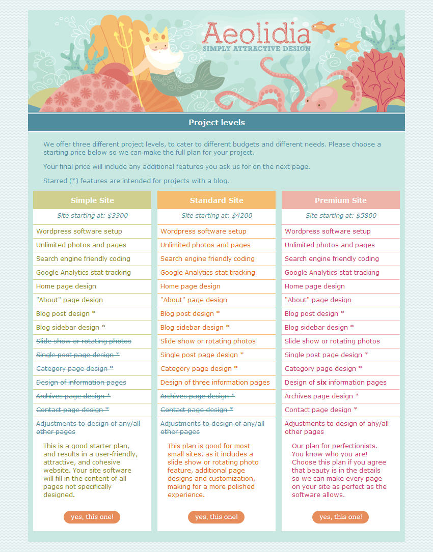
I followed the lead of subscription-based websites that offer different levels, but without promoting one level as the preferred one.
Results
One result of this change surprised me! With the new form:
- People now understood exactly what they were signing up for
- Our designers and developers knew how to do their work
- I no longer had to explain things over and over to everyone
These were the results I was hoping for. However, there was an additional result that I hadn’t anticipated: the very strong interest we got in the Premium plan after we instituted this chart.
Now, Premium is often chosen, and this has been a thrill for us!
Our Premium sites are so beautiful and fun to show off in our portfolio. We also have the great feeling at the end of the project of having done all we could do for a client to push them off in their new direction. The fact that many people choose our Premium plan also validates my pricing and tells me that we still have room to grow in the future.
How about you?
Are there any tweaks you could make to your process to clarify and simplify things for you and your clients? Is there a change you’ve made recently that has been a big success or relief to you?
I’m also open to questions about working with a designer, investing in a website, or prioritizing tasks when you have a tight budget.
If you have any feedback about our levels structure, I’d love to hear what you think!