by Edyta Szyszlo of Edyta Szyszlo Photography
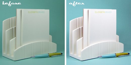
Hello all! I’m so excited to be a part of Oh My! Handmade Goodness! We know how important visuals are to properly market products, so I’m here to help make your product photography that much better! Several months ago, Sara contacted me looking for some Photoshop tips for her paper goods product photography. Here’s a general how-to process to spruce things up in Photoshop.
Lighting is absolutely the most important thing you can do for your product shots. Natural light is usually best for paper products along with proper studio lighting.
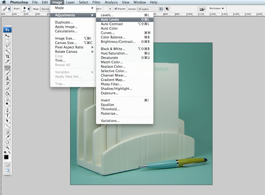
Sara sent me the shot above untouched. The first thing I do is “auto levels” located in ‘image’ > ‘adjustments’. In my personal experience, this works about 80% of the time (automatically adjusting the tone/depth/color of the image). You can tell when “auto levels” is completely off because it leans toward a certain tone (mostly magenta/red/green). You will have to determine what the true color of the image is. I went ahead and assumed this was correct…
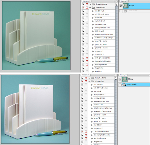
Above, you can see the difference in the original and then “auto levels”. If the image was off slightly with color tone, like the whites were too red then I would adjust the color balance afterwards (also located in ‘adjustments’).
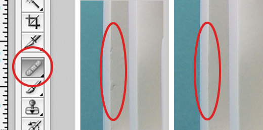
Then, zoom the image to 100% and clean up any marks, dust spots, etc with the ‘bandage’ and ‘clone’ tools (2 tools down from bandage). The difference between the two tools – ‘bandage’ imitates color/texture/pattern in pixels, ‘clone’ imitates color & pattern. I use ‘bandage’ most of the time, however, ‘clone’ is great for spots around edges. Play around, you’ll definitely see a difference.
After cleaning up, I adjust the contrast between the lights and darks using ‘levels’ manually. You can do this through ‘adjustments’, but I like to use the mask option below so I can paint my adjustments in. Click on the black and white circle… a window pops up with options, click on ‘levels’. It will automatically pull up the ‘levels’ window for your adjusting. I slide the middle notch to the left as well as the right notch to the left just a tad to boost the highlights and overall lighten. Select OK and it creates a layer with mask. You can use the paint brush (black) to paint back the highlights or original light. You use black to paint since the layer’s mask is white.
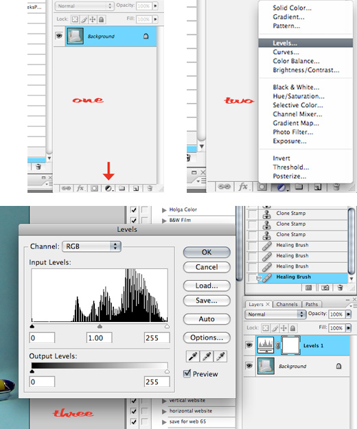
This tip is also great for white/solid color backgrounds. You can lighten the background so the white is clean and flaw free and paint back the object. When finished, I merged the layers. Below, back to the black and white circle > ‘brightness’. To add a little pop to the overall image, I slide the notch to the right to add brightness. You can also paint back. This is another great tip for white backgrounds or solid color backgrounds.
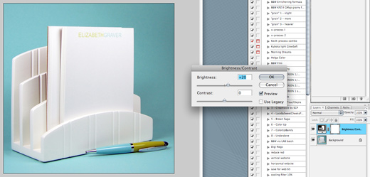
Sara’s concern was losing the text on the pad of paper in the process of brightening or making whites white. You can click on the ‘history brush’ tool (below the ‘clone’ tool) and then click the layer/box in the history tab of the preferred darkness that your text was. Zoom in to 100-150% or more to see the text and paint back just the text.
Extra note: my tools (paint brush, clone tool, history tool) are usually set at 100% flow but only 5-50% opacity to control my blending. Some adjust both, it’s a matter of preference. Basically, you want to avoid creating edges.
I think it’d be fun and inspiring to use readers’ products for future posts. If you’d like to send one of your products for me to photograph (I’ll ship it back), I’ll blog with a lesson to be learned right here at Oh My! Handmade Goodness. Or, send me a photo that you’d like spruced up. Email me at info@edytaszyszlo.com.

[…] be writing (hopefully once a month) about all sorts of photo tips. Check out my first post here. (and don’t forget to read the last paragraph, could be your lucky […]