guest post by Julie Corbett of On The Dot Creations
 image credit: Point and Click print from Parada Creations
We’ve heard it over and over again: great product photos are the key to selling more products online. But what about those of us who don’t have big, expensive cameras or fancy lighting setups? Can we capture great product photos too?
Anyone who sells products online is aware of the importance of great product photography. Customers are more likely to purchase a poorly-crafted product that has been well photographed than a well-crafted product that has been photographed poorly. Because our online customers can’t touch our products or see them in person, they rely on accurate product photos to help make their purchasing decisions.
So what are some tips to capture drool-worthy product photos (without an expensive camera)?
#1: Choose the perfect background.
Not just any background, mind you. We must search for the best background for our particular products.
Here are a few points to consider:
* What is color of the product?
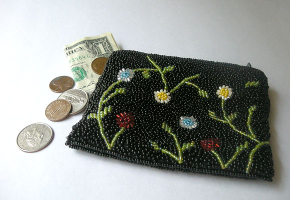
If the product is multi-colored, consider using a simple, single-color background. In the picture of my beaded coin purse above, I chose a simple white paper background, mostly because the product has multiple colors. The contrast of the black on white is powerful and eye-catching.
How about using a single-color background with some texture? Wood, stone, sand, and even grass are some examples of great textured backgrounds.
If the product is monochromatic (one color only), you can choose a more creative background. Perhaps a fun piece of fabric or scrapbook paper is just what you need. Just remember that the customer’s attention should first be drawn to the product, not the background.
* What is the theme of the product?
If the product is fun and lively (a child’s toy, for example), you could use a background with a little bit of spunk. If the product is soft or muted in color, you could use a background that looks calm and relaxing.
By the way, remember that a wild variety of different backgrounds in your product photos can give an unorganized look to your shop. Spend time trying different backgrounds and settle on one style that will look best with all of your products. Your shop will look more organized and attractive.
Additional reading about photo backgrounds:
Want Better Product Photos? Check the Background!
3 Ways Cardstock Can Improve Your Product Photos
#2: Choose the Best Lighting for your Products
Good lighting is critical for product photography. A multitude of photo problems can be solved with the right light source.
A handmade seller has many lighting options, but natural lighting often produces the best (and the cheapest!) results.
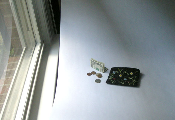
As you can see in the image above, I set up this particular photo shoot right next to a window. Even though a window provides lots of natural light, if the light is too strong, it could cast harsh shadows. In this case, you could cover the window with a sheer fabric that will allow light to come through while reducing shadows. (I have an opaque curtain that I use for this purpose, but really any kind of see-through fabric would accomplish the same effect.)
Outdoor lighting can be effective too, although you might have to deal with a few obstacles that could be frustrating:
* uneven surfaces (grass, for example)
* bugs crawling on the background (this has happened to me more than once 🙂
* wind that can move your product and/or background
* harsh shadows from direct sunlight
Open shade works quite well for photo lighting. The best time of day for outdoor lighting is early morning or late afternoon (when the shadows aren’t as harsh).
If at all possible, avoid using a flash when photographing your products. Read why in this post: Flash Photography: A Bad Idea for Product Photography
#3: Stage Your Products Tastefully
Not every product needs to be staged with props, but some minor (appropriate) staging can give your product photos just the “pop” they need!
First, let’s define staging. Staging is simply putting your products in a natural, appealing setting so that customers will be more attracted to them. Consider “home staging” – the process of making your home look brighter, larger, and more inviting so people will want to buy it. “Designed to Sell” is an HGTV show that focuses on this concept.
So what are some tips for effective staging?
* Show the Product in Use.
Photograph the product on a model or a form. If the product holds objects, photograph some of those objects inside. For example, fill a handbag or pouch with a wallet, phone, keys, etc. (at least for one photo angle). This is especially helpful to give the customer an idea of the size of the product.
Be sure that the objects you use for staging look natural with the product. For example, the coins look natural next to the coin purse above. These coins in comparison with the pouch give customers a better idea of the pouch’s size.
* Show the Product in Its Environment.
If you sell handmade soap, for example, you could photograph the soap in a soap dish, beside a hand towel, or with a sink in the background. Just make sure that the product for sale is the dominant item in the photo.
I love to look for staging inspiration in places like:
* Martha Stewart Living
* Real Simple magazine
* Craftgawker website
* Pinterest
* Show the Product with Other Items from Your Shop.
If you sell a coordinating item in your shop, by all means, photograph the items together. Not only will this make a visually attractive grouping, but it might also encourage the customer to purchase the coordinating item. Just be sure to explain exactly what the customer will receive for the price of the listing.
For example, if you sell handmade purses, photograph your handmade checkbook cover beside the purse. This helps customers get an idea of the size of your purse and it also shows them your checkbook cover product. Be sure to mention the other product (sold separately) in the product description.
* Compliment the Product, Don’t Distract From It.
Don’t stage your products just for the sake of staging. If the customer notices the staging more than the product for sale, your efforts will be in vain. Staging should be subtle and natural . . . not a distraction.
#4: Capture Multiple Angles of Your Products
I’m assuming that those of you reading this post have a digital (not film) camera. With digital, it doesn’t cost any more to take 100 photos than it does to take 10. You never know which angle will look great in your online shop!
* What does the back of the product look like?
* What is the depth (girth) of the product?
* What does the bottom of the product look like?
* How does the item look being used?
We must make customers feel comfortable buying our products online. How do we make them comfortable about a product they’ve never seen in person? By showing as many photo angles as possible!
How about you? Have you tried staging your products for photographs? Were your efforts a success or a flop? What about photo lighting? What particular struggles do you have in that area?
Feel free to share your thoughts and questions in the comments. I look forward to hearing from you!
Want more tips like these? I’m excited to announce that the first 10 people to email me at onthedotcreations@gmail.com with “Product Photo E-book” in the subject line will receive a complimentary copy of my 22-page e-book, “Capture Better Product Photos for your Handmade Business.” Hurry . . . these will go quickly!
P.S. Stay tuned for Part 2 in this series, when we’ll talk about my favorite (free!) photo editor, Picnik!


