by Isa Maria Seminega of Noisette Marketing
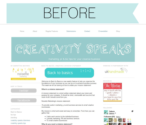
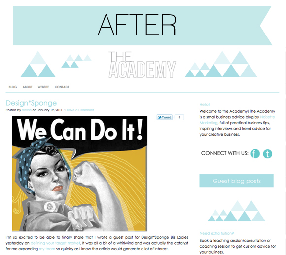
As we finally get to Spring I’ve been gearing up to relaunch the Noisette Marketing blog. I launched the Noisette Marketing website in January after previously selling on Etsy. I realised it was time to get self-hosted on WordPress and it made sense to relaunch the blog too, changing it’s name from Creativity Speaks to The Academy and freshening up the look. The Academy aims to provide a learning community for independent business owners, covering relevant topics on marketing, PR, branding, packaging, photography and creativity. The visual look of the blog is fresh and simple so I can let the great content do the talking!
So how can you freshen up your blog for Spring?
Whether you blog to promote your small business or to share snippets of your daily life in a more personal blog you can benefit from streamlining your content and simplifying the design. Freshening up your blog needn’t be a major overhaul. In the same way that a fresh coat of paint can change the look of a room, just a few small changes can help you feel more motivated and focused about what you are writing and enable your blog visitors feel comfortable enough to hang around bit longer.
Things to think about:
Before you start, consider the main aim of your blog? Is it to promote your business, to showcase other people’s work, to show your photography, share your family life? Whatever the aim make sure you keep this in mind when it comes to a revamp.
VISUAL
Experiment with colour and pattern.
If your blog is personal you may have more room to be flexible but you can still experiment with a business blog just keep in mind your branding so it still ties in with your overall look of shop or website. Sometimes all it takes is going one or two shades lighter in a colour scheme to make a design pop or adding a patterned background that is unique to you.
Less is more
Try to use white space to your advantage. I find that I’m drawn to clean designs that use a lot of white space whilst mainly focusing on colour and texture in the images and photographs that are used. White space is not just about leaving things blank though, you can also use white shapes to create a patterned background that doesn’t distract readers from the content of the blog.
Layout
What do you want your blog readers to focus on, your images or your writing? Depending on your main focus different layouts may be suitable. Adjust the column sizes to find something that meets your needs or try taking a column away to see how that looks. The more columns you have the less space you have for the middle column which features the content. As an avid blog reader it is the photos that draw me in, I want to be able to see what I’m looking at which is difficult if the photos are tiny!
Get rid of clutter
Simplify the sidebar. Make it easy for your reader to find what they need with helpful headings and categories. Check links are still relevant and that you favourite blog links are still working. I’ve lost count of the amount of times I click through a blog roll only to find half the links are wrong or no longer working.
CONTENT
Simplify topics.
Think about narrowing down the amount of topics you cover. If you have a focus on a handful of main topics your readers will know what to expect from your blog and it will be easier to get them to keep coming back for more.
Update your pages.
This one is important to stay on top of all year round. Check your About page is still relevant. Are you still a Mum of a 6 month old or is your child now starting school? What can you add or take away to give the reader a better idea of who you are? If you have them also check and update your contact page and FAQs.
Try a different angle.
If you want to share what’s new in your shop, instead of just putting a photo and linking to your shop, tell us about it. Show us your creative process, how did you get from A to B? Why did you choose that fabric or colour? Why do you do what you do, what is your reason for creating, writing, taking photographs or baking?
PLAN AHEAD
Planning out your content can be helpful no matter what the main focus of your blog is. Even if it is a personal blog having a simple plan can help to keep you on topic and motivate you to think ahead to what you want to share.
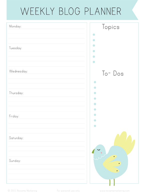
To get you inspired to think about your blog content I’ve designed a weekly blog planner where you can plan out daily blog posts, add a reminder of what your main blog topics are and space for some to-dos an easy place to remind yourself to get permission for copyrighted photos or find the original source for a link you will be sharing.


