During the holidays, designing a Look Book can be so beneficial to a business in many ways: it’s great for marketing materials, it’s handy for passing out at craft shows, it’s perfect for announcing new collections for the new year, and it acts a method of following up with your customers by reminding them to visit your shop. While figuring out how to use a Look Book may seem easy, designing one can be a whole other story. In this post, I share some tips on page layout, design software, and distrubuting your new look book online. What is a Look Book? It’s like a mix between a store catalog and an e-zine. You want it to sell something as well as be informative about your brand.
Wildfox Kids amazing Fall look book-click picture for more inspiration
Start with a Plan
As a business owner, you know that every successful decision you make for your business comes from having a good plan. Think of 3 reasons why you need a Look Book, 3 ways you will use/distribute your Look Book, and 3 ways it can increase your ROI or Return On Investment (because this will be a time-consuming project that will cost money if printed and distributed in person). An example might look like this:
I need a Look Book to feature my new products as well as show-off my whole offering, explain my custom services, and give customers an inside to look as to why my products are great by explaining a little bit about how I make them.
I will use it at craft shows, at conferences, and will keep in my car for potential customers I meet in passing.
I believe my Look Book will increase ROI by reminding them they can shop any time online from home, gives customers who didn’t have funds on their person or ideas on what to gift to purchase at a later time, and gives my family/friends something to pass out to help explain what I do when I’m not there to “sell it”.
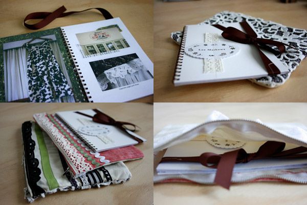
Lee Matthews look book designed by Jacqui Lewis
Selecting Your Design Software
If you don’t have a full-version of Photoshop on your computer or you’re not able to hire a professional designer who has Adobe suites then fret not. There are lots of free shareware and online apps that can help you design your look book. Shareware like GIMP.org, Inkscape.org, and Photoshop.com can help you get the job done for free. These sites come with either a User Manual for Support Forums for you to learn how to use them. Being familiar with the full-version of Photoshop would help you find the lay of the land more quickly. When setting up your files, be sure to have it set to CMYK at 300dpi in PDF format saved as Press Quality for printing or have it set to RGB at 72dpi in PDF format for publishing online.
Sketching Your Page Layouts
Yep, you read that correctly: sketching your page layout ideas. It’s true: anyone can sketch thumbnails much more quickly than doing simple mock-ups on the computer. Get a basic idea of how you want your page layouts through pencil and paper then take it to the screen, you will be amazed at how much time this will save you. The content is not necessary at this point, just know where you want your page title, paragraphs and images placed is key in this step. This is the step where you create the look and feel for your catalog with any article spreads, the shopping section, and the covers. It’s also when you decide on the size of your Look Book: if you want 8.5″ x 11″ or 5.5″ x 8.5″.
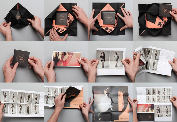
Draw In Light look book designed by We Are Useful via the dieline-click for more pictures
Producing Your Look Book
Now it’s time to start producing your catalog content. Some tips to get you started: gather product information, write your product copy that’s fresh for your Look Book (copy is the text), setup and shoot your product photography if needed (but be sure to include some fresh photos that aren’t shown on your site already). Remember: your product descriptions should be 30-60 words long, show all options for each product if any but don’t let their size overrun the main product photo, make your product copy marketable but also something that can allow your buyers to make an informed buyin decision, highlight key points on your cover, and be sure to always include your contact infomation that can be relevant for in-person and online shoppers.
ban.do look book designed by Bri Emery of Designlovefest
Rules of Good Look Book Design
- Appeal to lifestyle desires by knowing what makes a person buy
- Use quality imagery and graphical elements
- Limit your use of fonts and keep it simple and cohesive
- Design for your target market, not your personal preferences
- Keep the style consistent from issue to issue to help build and support your brand design
- Make the product the main focus
- Important items should go on the outside of pages
- Remember to Up-sell or Cross-sell your products and services
- Give products room to breathe by taking advantage of the white space
- Look Books that are 4 pages are pefect for starting out shops while 8 or 16 page are ideal for larger shops with bigger budgets
- Analyze your resuts for making improvements and tracking your ROI
Distributing Online and Publishing in Print
For sharing online, I’d highly suggest ISSUU. It not only lets you publish and host your Look Book online but lets you easily turn it into a presentation, share via email, or embed it into your site using HTML coding with nifty auto-turning pages that makes your online Look Book seem real and definitely cool. Another option would be HP MagCoud, who has online pubishing for iPad and printing options. For printing your Look Book, check various vendors to see which one best fits your budget. JakPrints.com and GotPrint.com have catalog printing options as well.
Enjoy!
I hope this helps to give you a great head start on creating your own Look Book and to give you some insight into the process. If you’re a freelancer like myself, you might find Look Books to be more of a chance to show off your portfolio rather than sell specific items. I have plans for creating my first Look Book for the new year, what about you?


