I love rebranding! There is something so very exciting about seeing a business get a new look and watching how the design process can bring people together. I invited Lisa of Petite Tuques to visit us and bring her designers, two Oh My! contributors, Mayi Carles and Zoe Rooney to share the behind the scenes of Lisa’s new (awesome) design. I couldn’t pass up the opportunity to share the story of how working with the right designers can be a challenging, creative and often life changing experience. Thank you Lisa, Mayi and Zoe for giving us this inside look at the rebranding process.
Hi Lisa! It is really exciting to share your business and the complete redesign of your brand by two of my favorite people of all, Mayi Carles & Zoe Rooney! Tell us about your business Petite Tuques and what inspired you to redesign and relaunch your brand.
I started knitting gifts for friends in 2009, and that’s when it dawned on me that I could take it another level and open up a shop. I went through three different graphic designers because I wasn’t sure what I wanted my brand to represent – but after getting some coaching from Mayi, I realized what I was all about, and decided to make a complete makeover of my shop & blog, and tweak my product lines. I would love to know about the process of finding your (brilliant!) designers and how you worked together to transform your business.
In what ways did working with Mayi and Zoe help you find the perfect look for your business? What work did you have them do for you?
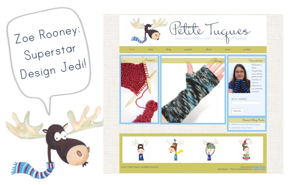
I hired Mayi to coach me, because I knew I needed help, and she offered to do my illustrations the first session! I was excited because she’s very talented, but also very different than the “usual”. I still wanted a mascot, but owls were overdone, so I suggested a moose, and she got to work!
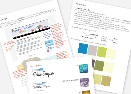
I met Zoe through Artrepreneur, and I was impressed with her knowledge of WordPress. I talked to Mayi about her first, and then talked with her through her 15min free chat. Zoe wrote up an action guide of my site, and she was spot on! We picked the same font for my website, Mrs. Blackfort, without talking to each other, and her suggestions on how to run my website, “less blog-like” so that I could be more free with designing and bringing in more products to my shop was genius. In reality, I wanted to do so much more than just knit up hats, but my website at the time was holding me back. I’m not a big blogger, so taking away the blog as the focal point of my business, really helped to bring out my talent. It was a big relief to me!
Lets take a look at your old branding before we go behind the scenes with the designers-what didn’t work about your brand? Are there elements you wanted to keep in the new design or were you ready to start from scratch?
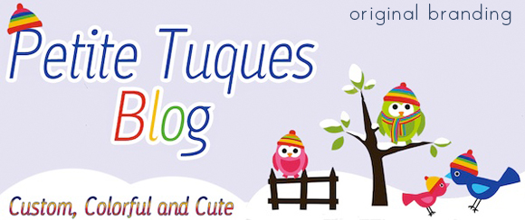
I was ready to start from scratch! I wanted to look professional, stylish, and “grown up”. I wanted to keep the feel of being Canadian; I had the snowy owl as a mascot, which is the official animal of Quebec, but I wanted something a little different, so we went with a moose, which is very Canadian.
Thank you for sharing this insight into your business Lisa! I am sure that with your new beautiful brand and website this is the beginning of wonderful things for Petite Tuques, where can we find you and follow along?
Now for some insight from the designers behind the branding:
How do you do it senorita? Every time I turn around you are creating something even more awesome! Tell us about your part in creating Lisa’s new brand and how you came up with your sweet, whimsical illustrations.
Awwww stop it. Okay don’t, LOL. Seriously though, thanks for loving my creations + always supporting my crazy creative adventures señorita.
Back from tangent. I had the great fortune of meeting Lisa inside April Bowles monthly membership site – ARTrepreneur, helping her revamp Petite Tuques through a Shop Critique. Weeks later in the spirit of digging deeper + destroying all sound barrier to success, Lisa + I began working together one on one to work through her larger than life ideas + alleviate her fears + laser in on the wisest course of action; branding being top on the list.
Lisa’s brand needed a serious overhaul, but most importantly I sensed Lisa desperately hoped for a fresh beginning. So I suggested something a bit crazy – to hire an out-of-the-box-kinda-wacky designer to bring forth the spunk + edginess her brand longed for. I was happy to discover she picked me. No offense taken on the wacky part.
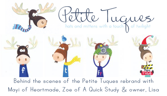
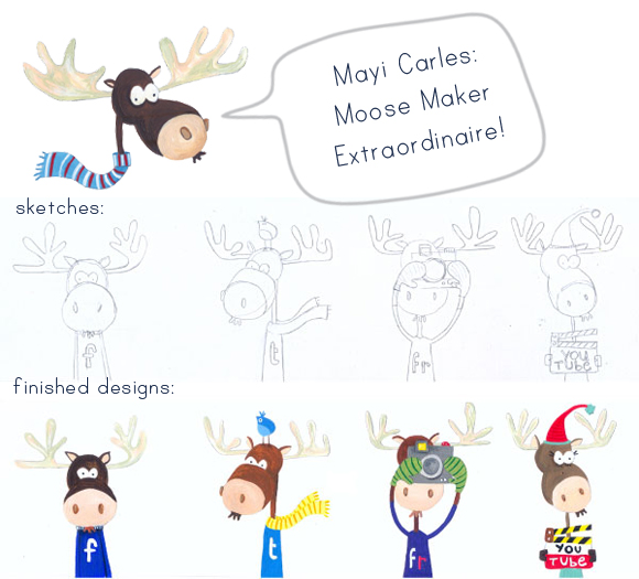
And so, “a moose”, Lisa suggested. And with that prompt alone I created a collection of moose inspired whimsical wintery illustrations for Petite Tuques.
I’m convinced the friendship + level of commitment Lisa + I shared throughout the whole process played an instrumental role in the success of the project. So much so that Lisa approved my illustrations during the first round!
That’s what I call rockstar team work. Booyah!
You are such a superstar, I am endlessly amazed at how you balance creativity with your technical knowledge! Please share with us how you used your Jedi design skills to help Lisa rebrand and the process you went through as a designer and consultant to create her new look.
This was such a collaborative project! Lisa and I started with a site review and action plan, which allowed me to hear her ideas for changes and to take a comprehensive look at her existing site and her inspiration sites. During this process, I did a lot of research including things like:
• keywords we came up with to describe Lisa’s brand
• various sources of inspiration such as other sites, random images, etc.
• Lisa’s products
• competitors and sites in similar niches or with similar audiences
• Lisa’s target market
• fonts, colors, textures, etc.
All this research culminated with a written report with my notes on the existing site (and comparisons with other sites) and my recommendations and suggestions, with specific references, sources, and links.
Then, Lisa hired me to tackle many of the action steps I’d identified in the report (this isn’t always the case – sometimes clients go on to do many of the steps themselves or with other designers, but we were grooving so we kept at it).
I love working with other artists, so it was great fun adding Mayi’s illustrations to the mix. Mayi and I were already comfortable working together and communicated directly over a lot of the more technical stuff, which also contributed to the smoothness of the overall project. (Also, obviously her illustrations are to die for. Seriously, I’m going to have her do custom portraits of my kids, I am that obsessed.)
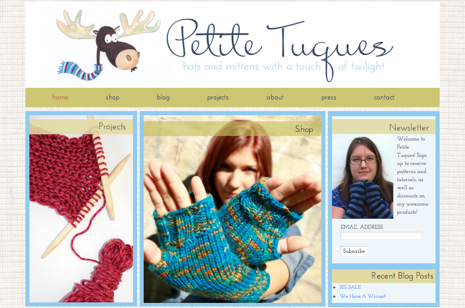
The site review is always a great place to start, because it gives me a lot of info to transfer into the design process (I actually take a lot of the same steps with new design clients, which is why I sometimes deduct the fee from the review from the custom design work cost). From there, it was all about developing a strong content strategy (leveraging much of Lisa’s existing content, plus adding some new organizational systems for her tutorials and patterns) and styling that content!
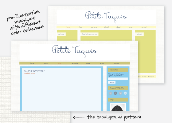
Because we were so collaborative and communicative, the only major changes from early drafts to later drafts were some of the colors – the background texture and the layouts stayed mostly the same.
So the Jedi design trick? Primarily research. Good design is based on having a strategy, knowing what you’re trying to accomplish, and only then applying things that look nice via colors, fonts, textures, layouts, illustrations, and so on. And of course having an awesome illustration set that is so smartly based in a branding strategy helps!
Editor’s note: Wasn’t that amazing? Combine 3 talented ladies with one common purpose + good communication and you get a stunning redesign and a brand that will make a great impression. Fabulous job Lisa, I can’t wait to see what the future holds for you!

