You may already know the difference between serif and sans, and it’s usually pretty easy to recognize a script typeface when you see one, but from there the language of typography and fonts gets decidedly more hairy. Glyphs and ligatures, opentype and web fonts, and what about those mysterious ems? Starting today, we’ll be working together to demystify, clarify, illustrate, and elaborate on all the wonders of type in a series of posts called “Teaching Type.”

We’ll be mixing theory with practical advice so that you feel more comfortable talking about and using type in your work or describing what you’re looking for, and what you do and don’t like next time you’re talking to a designer, starting today with some foundational terminology.
You may have noticed some people getting a little tetchy when the words font and typeface are confused, not to mention what happens when lettering is thrown into the mix (oh, the nerdy drama). I find this unfortunate, as it makes other well-meaning design enthusiasts uncomfortable and makes those in the know seem a bit snobby and exclusive.
While these three terms are often used interchangeably, there are, in fact, some nuanced differences between them. I think that knowing the differences can open your eyes to greater possibilities in design, so that’s why we’ll talk about them here.
Typeface: A set of glyphs (characters, symbols or pictographs) in a particular style or design.
Font: A set of type (for example, a set of letterpress blocks or a digital file) in a particular design. Often fonts are made up of an alphabet along with some punctuation and numerals, but not always. Also often refers to a single weight (keep reading for more on weights).
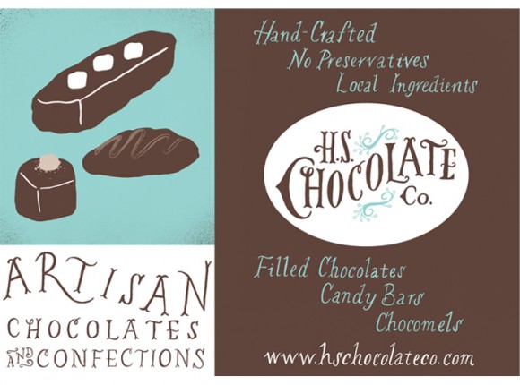
Lettering: The writing, carving, or otherwise marking of letters. Often lettering is created for a particular context vs. an entire alphabet in a font that can be rearranged to create endless words.
Lettering by This Paper Ship for H.S. Chocolate Co. via an Aeolidia project
If you want to read more on typefaces vs. fonts, I recommend this article on the AIGA site. Be sure to read the comments for more info and to start to get an impression of the attitudes surrounding this topic. We won’t get too crazy on their use from here on out, but the important thing is to consider that there are different designs and styles of glyphs, and then there are various techniques for putting those glyphs together. Also, sometimes artists and/or letterers create custom lettering that’s context-specific for things like posters, logos, and signs (and it’s not always as expensive as you might guess).
In the world of typefaces and fonts, there are a few other foundational terms to know:
Weight: Many typefaces are available in multiple weights, meaning various degrees of “boldness.” Terms like light, book, bold, and black all describe weight, as do numbers like 300, 400, 900, etc. Computers often allow us to fake-bold type (using the bold button), but you usually get better results for design purposes when you use an actual bold weight, as they typically contain subtle changes to the letter shapes to account for the increased visual weight while maintaining the design.
Classification (a.k.a. category): I name-dropped a few classifications at the beginning of this post, and you probably are already familiar with some of the most common:

Family: A family is a group of fonts distributed together. Families often include a book (or “normal weight”) version along with italic and bold styles, but they can get much more complex, adding in condensed and/or extended versions, or more weights, or even different classifications. The largest families are sometimes referred to as systems.
Now that we’ve got the basics down, we’re ready to get out our microscopes and dive deeper in the shapes and forms, and use that knowledge to better inform our decisions about which typefaces we use, and when and where we place them. Until then, I’d love to see your questions and topic suggestions for this column in the comments or via email!


