Good day Oh My-ers! I am thrilled to be here today to share this month’s tutorial goodness with you!
Last month was all about food for the soul here at Oh My! Like many folks, I have a “special” relationship with food due to chronic illness – but I love to eat, and I absolutely adore food’s ability to gather people together, to nourish, to comfort, and to heal. So in the spirit of delicious creativity, I added a tasty dimension to our tutorial this month by integrating one of my favourite dishes, pancakes! My favourite pancake recipe is gluten-free (although you can’t tell) and is best served with maple syrup, strawberry sauce, bacon, and lots of friends and family around the table.
Back to our tutorial. Last month, Nicole of Chicago Fine Threads Luxe wrote: “I make custom handbags. I would like to learn how to make a photo that shows multiple images of fabric swatches.”
No problem Nicole! Thanks for the suggestion! How fun, a layout request. This means we’ll be firing up Illustrator! Don’t worry, it won’t be scary, just follow the steps – and remember to KEEP SAVING, REGULARLY AND OFTEN. Make yourself a nice cup of tea and get ready to wrangle those swatches, spoonful of sugar style. Let’s get started!
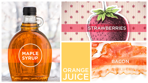
As with cooking, it’s important to do your mise-en-place before you begin assembling your masterpiece. That way you’re ready with all your ingredients and won’t have to stop and scramble to gather what you need. In this tutorial I would like to show examples of both images and colours, so I have collected/created strawberries, maple syrup, bacon and orange juice, and I’m ready to go.
This is dependent on where you want this layout to go – Etsy? Your blog? A catalogue? Determine where this file needs to live first and then use those measurements as your guide. If you are unsure about web vs. print, you can learn more from my series about image optimization. In this case I’m going with a width of 580 pixels to match our Oh My! Handmade Goodness blog width. I’ve arbitrarily chosen a height of 600 pixels but since it is a blog image the height has some flexibility, so I could adjust it later if I needed to.
1) Open Illustrator, then create your file with the dimensions you need.
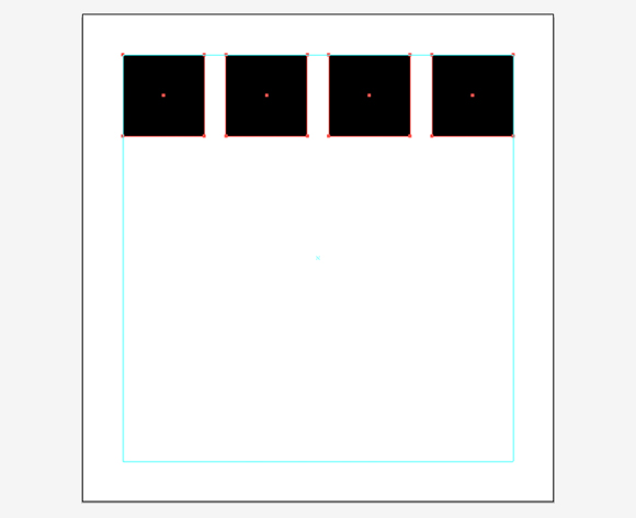
In layouts, alignment is everything. You want your final layout to look clean and polished, and nothing makes a layout feel distracting and disarrayed like misaligned doodads. We also want to give our layout a bit of breathing room, so let’s start by giving ourselves a margin of 50 pixels all around.
2) In the Layers palette (Window > Layers) double click the layer you are working on – it should be the only layer there – and re-name it “guides”. Click OK.
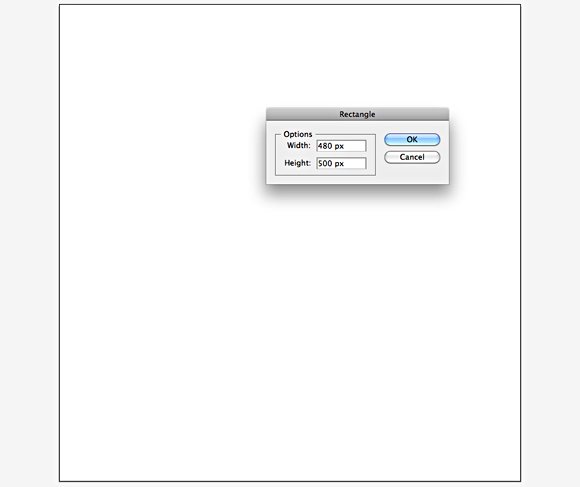
3) In the Tools palette (Window > Tools) select the Rectangle Tool (M) and click anywhere on your artboard. Enter the dimensions of your file size minus 100 pixels, so you end up with a box that will have a 50 pixel gap on all sides between it and the edge of the artboard.
My file size is 580 by 600, so I entered 480 by 500. Click OK.
4) In the Align Palette (Window > Align), make sure Align to Artboard is selected from the dropdown, then click Horizontal Align Center and Vertical Align Center.
Your box should now be perfectly centered within your artboard.
5) Go to View > Guides > Make Guides.
If you don’t see anything, hit command-; or View > Guides > Show Guides. Your rectangle has now become a margin guide for your layout! Well done you. Let’s move on!
Next we want to set up our swatch boxes. Later we will establish what goes in them, but for now we just want to create our box layout.
6) Go to View > Smart Guides and make sure they are selected – there should be a check mark.
7) In the Layers palette, click Create New Layer from the bottom menu and re-name it “boxes”.
8) In the Tools palette, select the Rectangle tool again, and click on your artboard. Enter 100 by 100 pixels and hit OK.
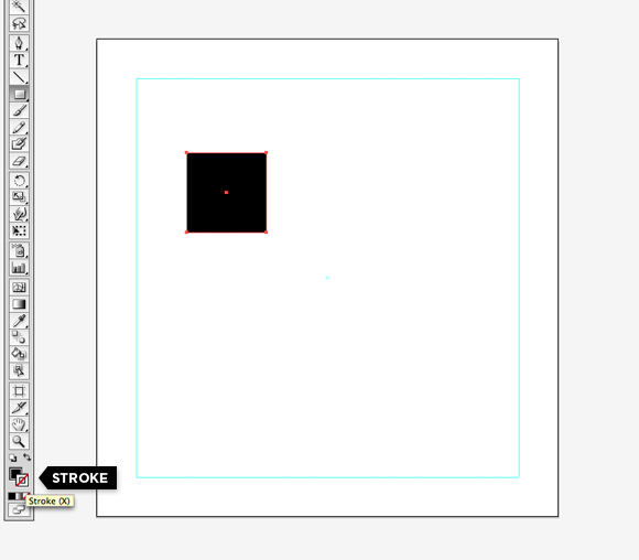
It doesn’t matter quite yet what colour is filling the box, as long as it isn’t white. We need to eliminate the stroke (outline) that surrounds the boxes.
9) Take a look near the bottom of your Tools palette at the Fill and Stroke symbols (you can hover your mouse over them to identify them). You can bring the Fill symbol to the foreground by hovering over it to identify it then clicking on it. If you wish, you can choose a colour from the colour palette to assign as your fill. Then bring the stroke symbol into the foreground and click the white box below it with the red line slashed through it (None) to eliminate the stroke.
10) In the Tools palette, select the Selection tool (V) and click and drag your box slowly towards the left margin guide you created. It should snap up against the guide once it gets close enough. Without letting go of the mouse, drag the box to the top margin guide so that the box is now snapped into the top left corner of the margin.
Next, we want to make multiples of that box and distribute them evenly between the margins.
11) With the square selected, hit command-C to copy, then command-F to paste in front. Then click and drag the square to snap into the opposite corner (top right) of the margin.
12) With the new square selected, hit Command-C and command-F again, twice.
13) Select all boxes by hitting Command-A or going to Select > All.
14) In the Align palette, make sure Align to Selection is chosen from the dropdown, then select Horizontal Distribute Center.
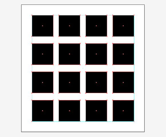
You should have four squares distributed evenly from the left margin to the right! Yeah! Now let’s copy and distribute the squares vertically.
15) With all four squares still selected, hit Command-G or go to Object > Group to group them together.
16) Hit Command-C and Command-F to copy and paste in front.
17) Click and drag the copied group of squares down to snap against the lower margin. Make sure the grouping remains between the left and right margins.
You should now have four squares along the top margin and four squares along the bottom margin.
18) With the bottom four squares still selected, Hit Command-C and Command-F again, twice.
19) Select all boxes by hitting Command-A.
20) In the Align palette, select Vertical Distribute Center.
You should now have sixteen boxes, equally distributed between the margins! Would you just look at that evenly distributed goodness?
21) Select all boxes by hitting Command-A, then Command-shift-G or Object > Ungroup to ungroup the squares from each other. Click anywhere on the artboard to deselect everything.
You’re almost there! Time for a snack… mmmm. Okay, you’re back.
Now it’s time to grab your carefully planned elements and bring them into play.
If you would like to use your images at their current size, you’re ready to get started. However, if your images need re-sizing, ideally they would be prepared ahead of time in Photoshop so that you can avoid re-sizing your images in Illustrator. For image re-sizing tips, feel free to refer to this post about image optimization.
22) Go to File > Place and select your first item from your hard drive. Click OK.
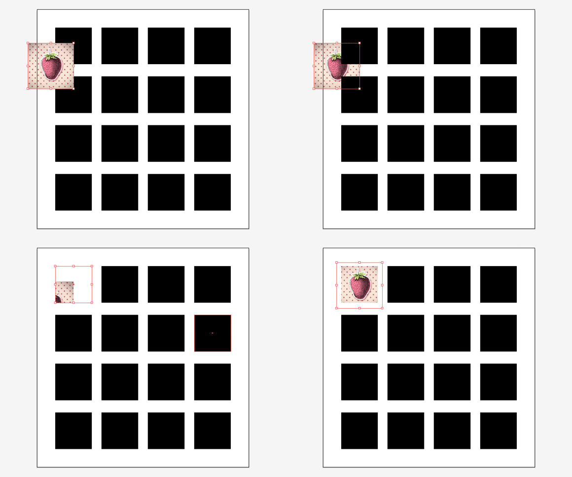
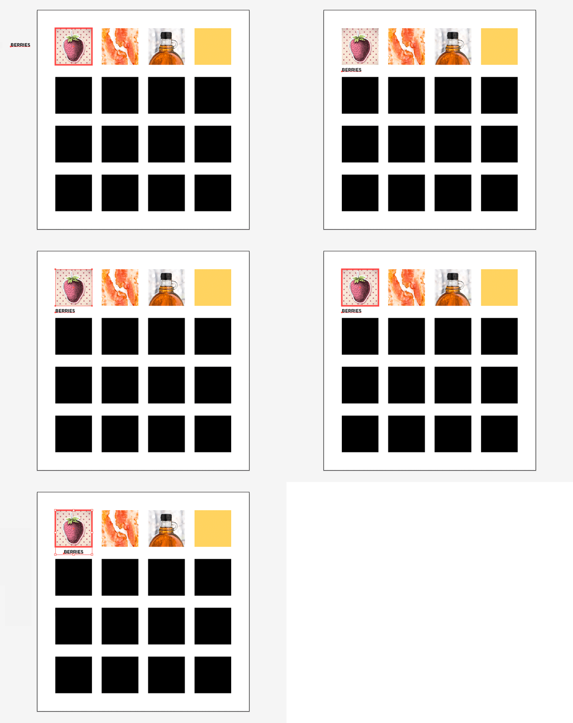
Next, we want to pop our image into its respective box. To do this, first we will need to place the image behind the box you want to use.
23) Click and drag the image in front of the box you want to place it into. Then hit Command-shift-[ (or go to Object > Arrange > Send to Back).
Your image should now be behind the box.
24) With the image still selected, hold down the Shift key and click on the box you want the image to go into. Both the box and the image should be selected. Hit Command-7 (or go to Object > Clipping Path > Make).
Your image should now be contained within the box you selected. Chances are it’s not quite in the right position though. If you’d like to move your image around, click on a blank spot to deselect anything that may still be selected, choose the Direct Selection Tool (A) from the Tool palette and click and drag your object around until you’re happy with its location (or until it snaps to the margins, if you’d like it exactly aligned with your box).
If at any time you’d like to re-position the images within their respective boxes, always use the Direct Selection Tool (A) and hover over your image until you can see its outline (this will only work if Smart Guides is turned on, which we did earlier), then click and drag. Otherwise you will succeed in moving the box but not the image within it.
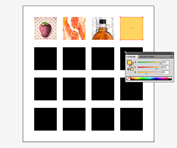
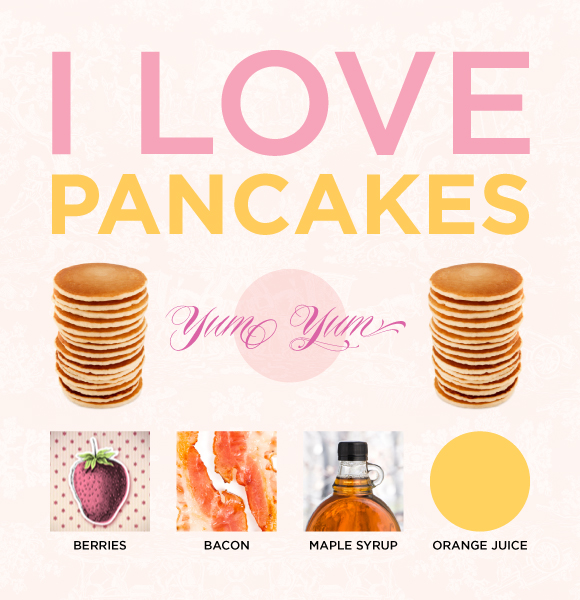
Repeat this process for any and all images you’d like to include in your swatch menu. I added my strawberries, bacon and maple syrup to my swatches.
For a different example, we will modify a box that just needs to be a colour.
25) Using the Selection tool, select your box. In the Colour palette (Window > Colour) make sure the Fill icon on the left is in the foreground – if it isn’t, click on it.
Hover your mouse over the colour bar that runs along the bottom of the Colour palette and click to select. Alternately, if you know what your colour profile is, you can enter the numbers into the corresponding boxes on the right. If you need to reset the Colour palette to CMYK or RGB, you can do so in the palette drop-down.
Take a moment to admire your boxes and all your hard work. Alignment, consistent shapes, pretty colours and textures, yay! Looks good. Now they just need to be labeled and you’ll be all set.
26) In the Character palette (Window > Type > Character) select your favourite font.
27) Select the Type tool from the Tools palette (T), click anywhere on your artboard and start typing. When you are finished, click on the Selection tool to exit the type box.
28) Using the Selection tool, drag your text to the appropriate height you want, below the box.
Next, we want to align the text with its corresponding box. Alignment, alignment, alignment! We love alignment 🙂
29) With the text still selected, hit the shift key and then select the box you want to align the text with.
Both the text and the box should now be selected.
30) Let go of the shift key and click one more time on the box. The box should now have an extra highlight around it.
You’ve just instructed Illustrator to align anything selected with the box, i.e. the box is a key object and won’t move during the alignment. Otherwise that would ruin our beautiful layout!
31) In the Align palette, make sure Align to Key Object is set in the dropdown menu, then click Horizontal Align Center.
Now your text is centered with your box! Alternately, you can choose to align your text to the left or right, if that works better for you.
32) Click anywhere on the artboard to de-select your items.
Now you need to make sure that any new text labels are aligned horizontally with the one you just set up, to keep your lovely layout consistent.
33) Select the text you just aligned, hit Command-C (copy) and then Command-F (paste in front).
34) Use the right arrow key on your keyboard to shift the newly pasted text towards the right. Be careful not to hit the up and down arrow keys, as this would mess up our impeccable alignment! To speed up the process, hold the shift key down as you hit the arrow key.
35) To change the content of the text, double click on the text and type away. Hit the Selection tool to exit text mode.
Go ahead and repeat the alignment step above to center this text with its corresponding box, and then continue as above for the rest of your boxes.
Oh my golly, are we done?? We are! Congratulations, you Illustrator wizard you! How absolutely stupendous. Time to reap the rewards of your hard work, so upload your image wherever you need it to go and pat yourself on the back. More snacks!!
I’ve decided that my orange juice box would be more appropriate if it were a circle. Do we need to delete the square, draw a circle, and start fiddling with alignment all over again? No! Here’s a little shortcut:
1) Select the box you want to convert to a circle.
2) Go to Effect > Convert to Shape > Ellipse.
3) Select Absolute, then enter your dimensions.
In this case our boxes are 100 x 100 pixels so I entered 100 for both width and height, then clicked ok. Voilà! Houston, we have a circle.
I hope this was helpful, Nicole! That’s it for this month, Oh My lovelies! If you have any questions, feedback or special requests, please leave them in the comments below. See you all next month!
Hugs and kisses, the Graphics Governess.

