Editor’s note: Big thanks to Jen Pepper of peppersprouts for visiting us to share the story of how her packaging has evolved over time and a round of hurrahs to Marisa of Omiyage for inviting Jen to tell her story here!
When I started peppersprouts back in 2009 I had no idea what I was doing. I didn’t wake up one day and decide to start a business, it just sort of happened over a period of about 3 months. I came across a discount code through etsy for a company called ponoko and decided to give it a try. I was working as a design director in NYC at the time but I loved the thought of creating and designing things without a client or boss dictating what could and couldn’t be done. I wanted free reign to try things out and see what worked and what didn’t for myself. So I sketched out an idea for a set of coasters, scanned the sketch into my computer, spent some time in illustrator digitizing the design, and sent one set of Silhouette Coasters off to be laser cut. Friends of mine thought they were really fun, so I decided to list them on etsy ( I was selling prints and stuffed owls at the time). Once the first set of coasters sold, and then another and another, I knew I had something that people really loved, and so Peppersprouts was truly born.
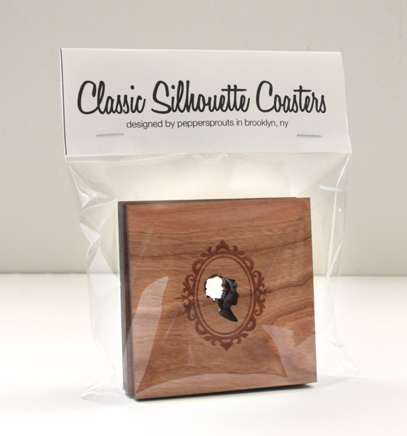
But of course, just having a tangible product is only one piece of the pie. These coasters needed some sort of packaging to be displayed in. My first thought was to make a paper belly band that wraps around the set of coasters that will hold them together. But that wouldn’t work, because the most important aspect of my very first coaster design was right in the center of the coaster. So I decided the best (and of course least expensive) way to package my coasters sets would be in a clear cello bag with an informational tag stapled to the top, as seen above.
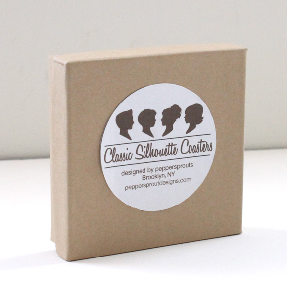
As a graphic designer, I knew this was pretty bare bones packaging. It was functional but no one would ever put this on a store shelf looking this way. So I checked out out some cool gift shops that I dreamed would one day carry my work and decided they needed to be in a box. While I no longer have the original kraft paper boxes I chose to use, this photo pretty much sums up the look and feel of the next iteration of packaging—super boring. Unlike the cello bag, you can’t even see the coasters inside the box, plus I ended up having to stuff the box with tissue paper to make sure the coasters didn’t rattle around inside. Not ideal.
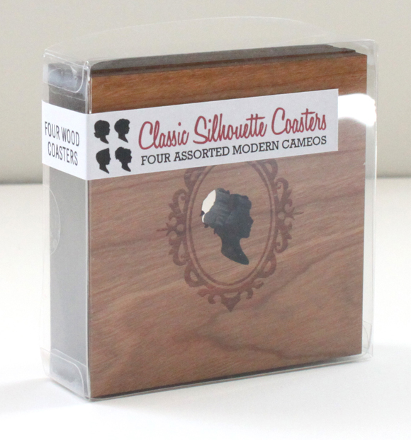
I thought for a while, did a little research and decided I would love to have a clear box. A box where you could see the beautiful designs held within. I actually lucked into finding a box that housed my coasters perfectly.. It was intended to hold 4 truffles as wedding favors and was available in bulk. Perfect! The first label I used was a wrap around sticker, so there was a bit of information about the coasters whichever way you looked at them. I thought this new packaging idea was awesome. But after using it for about 6 months I decided it needed a little facelift as well.
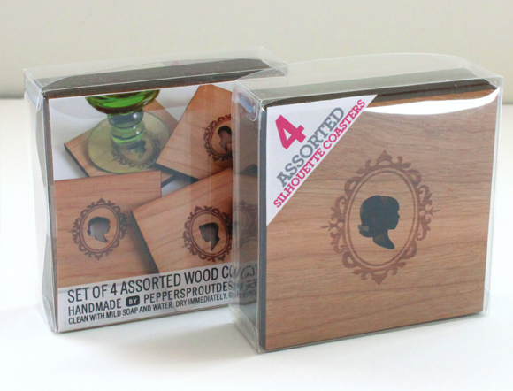
So I changed it up a bit. I kept the box. Color coded an exciting triangle label for each kind of coaster design (houses, silhouettes, chairs) and added an informational sheet inside the package so you could see the coasters in action; a sort of beauty shot to add some pizzaz to the overall presentation. I was very happy with this packaging for last two years. The customer can see what they are buying, get all the important information about the product and it stands up on its own! What more I could I really ask for? Then I started thinking: What if you could touch the coasters? What if you could take them out of the box and look at them without ruining the packaging? After all, these clear boxes were closed up with little circle stickers on the sides.
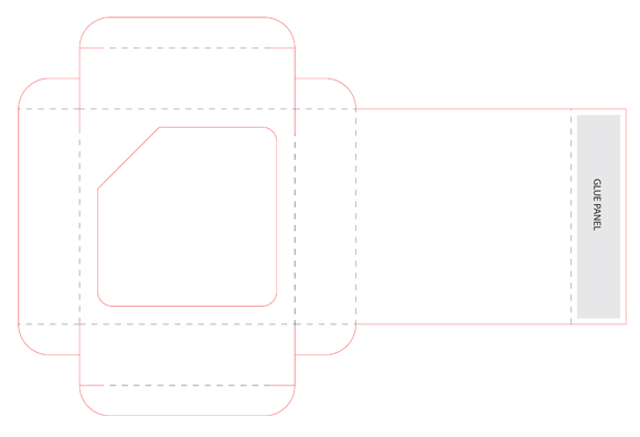
I dug out my copy of the Packaging Designers Handbook, and designed a box layout to hold my creations. I reached out to a number of printing companies who sent me personalized quotes and samples of packages they had printed in the past. I wanted to make sure I was going to be able to afford to print my own packaging before I started to fully design them. I fell in love with the branding, samples and awesome personalized attention I received from Oliver Printing Co. This crazy idea I had was a go!
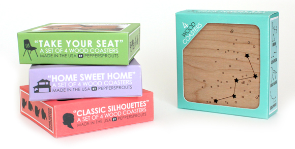
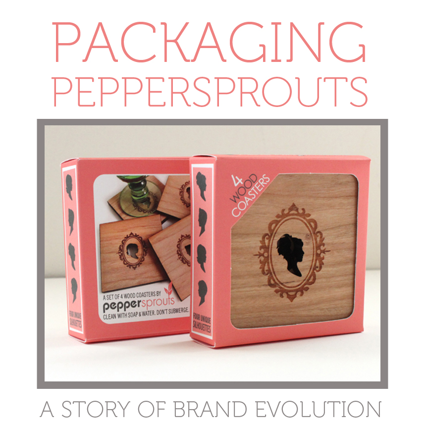
So I started designing this my new little box. I added a cut out window on the front so you can touch the wood. The side panels show the silhouettes that are inside since each coaster is different. I decided on unique colors for each different coaster design, so they stand out from each other at shows and on store shelves. And I kept the beauty shot of them on the back along with care information.
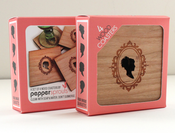 I am so excited to finally share with you the brand new packaging that now accompanies Peppersprouts wood coasters. It was so much fun making this project come to life, and I really couldn’t be happier!
ABOUT JEN
Living in New York City can be hard. Living in a basement apartment with one tiny window is even harder, especially if you grew up with the woods in your backyard and the ocean just a bike ride away. So in 2009, in a tiny apartment in Brooklyn, Jen Pepper started making home goods that reminded her of childhood adventures, while still being modern enough to fit in with her city digs.
While Jen no longer lives in that tiny studio, she continues to fuse her love for nature with her love for design, creating a range of home goods and personal accessories that look right at home in the country or the city. By using modern manufacturing techniques, and a little elbow grease, Pepperpsoruts brings a little bit of nature to your urban jungle.

