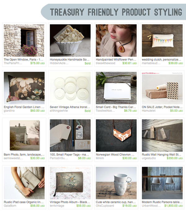
Treasury Curated by Amber of Red Tile Studio
In my blog post last month Grow Your Etsy Shop with Treasuries, I explored the world of Etsy treasuries and how this tool can help your business thrive. As a co-leader of the treasury team Elite16 on Etsy, I tapped into the extensive knowledge of the team members to get a range of experience based insight. This month, I will be focusing on product photography as viewed from the perspective of a treasury curator – what do they look for when putting together a collection and what advice do they have to offer? We’ll hear from 5 team members: Caroline of Dark Ride, Carolyn of Romy & Clare, Jenn of Palimpsestic, Anna of Studio by the Forest and Lauren of The Haunted Hollow Tree. If you haven’t read my post from last month, you might want to take a moment to give it a read so that we’re all on the same page as we move forward. We’ve got a lot of ground to cover, so let’s get started!
EXAMPLE IMAGES
I jumped in by asking members to give 3 examples of images they love and follow with a brief description as to why. After reviewing the information provided by each of the 5 members, I saw a pattern emerge and organized the answers into 4 different photography styles. I’ll be focusing on Bokeh, Clean & Simple, Drama & Movement, and end with Jenn of Palimpsestic’s insight on Evoking a Feeling.
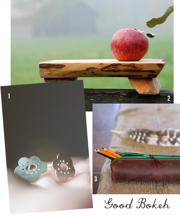
GOOD BOKEH
1. o bliss jewellery ♦ 2. Gray Works Design ♦ 3. Blue Mountain Thyme
The word “bokeh” is derived from the Japanese word for “blur” and refers to an aesthetic quality where an area of the photo is out of focus. As seen from the sample images above, when done correctly it lends a really beautiful aura to your product and enhances your items. The focus is crisp on your product while the rest of the photo speaks through the blur, which is different than having a blurry image that does not show your product. Here, it really gets highlighted without a background that is distracting and cluttered. There are many images on Etsy where the entire image is blurry and messy looking props are used in the photo – which really takes away from what you’re trying to sell. Working in the bokeh style of product photography, one is able to use props to create a setting that ultimately acts as a background wash that tells a story about your product without taking away from it. When Caroline of Dark Ride is curating a treasury, she’s looking for images “…that not only offer a sense of the product, but also evoke a sense of the seller’s style.” Bokeh style photographs lend a really nice touch when curating a treasury and are actually one of my favorite to include when I’m creating a collection!
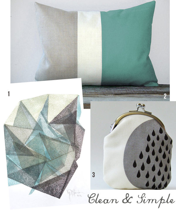
CLEAN & SIMPLE
1. Emerald Snow ♦ 2. Jillian Rene Decor ♦ 3. oktak
The next approach is to keep things clean and simple. Put the focus directly on your product with a minimal background – a small prop or a plain white background. Many of the images in my Etsy shop Pig and Fish are photographed in this style and I find it makes the product treasury friendly. Images where I photograph the product in an environment tend to limit the type of collections the product can be featured in – for instance, office, redecorating or home decor themes. When I photograph on a plain background, the item has the flexibility of being used in a larger variety of treasury themes. Remember, the more your items get used in treasuries the more exposure your shop will get, especially if the collection you’re featured in makes it to the front page of Etsy! With clean and simple product photography, there is nothing to get in the way and you can therefore communicate in a clear and direct fashion. This type of photography is probably one of the most widely used styles in treasuries and is easy to incorporate into a collection. Lauren of The Haunted Hollow Tree selected image #1 and notes, “Crisp and clean close up shots of sharp detail can go a long way in making a collection striking.” When I’m curating a treasury, I like to use them as a way to punctuate a collection to keep the balance even and not too heavy.
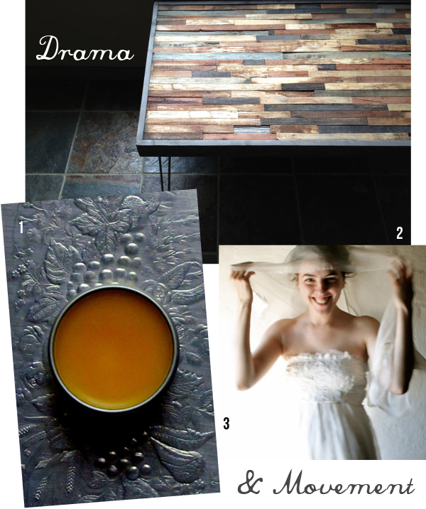
DRAMA & MOVEMENT
1. Marble and Milkweed ♦ 2. The Zen Artist ♦ 3. Larimeloom
Treasuries which carry the drama and movement throughout the entire collection are more of a challenge to curate than a more clean and modern treasury, but the results can be stunning. Anna of Studio by the Forest states about image #2, “This photo is the perfect example of a mood type photo. It’s on the dark side, but the table absolutely glows with warmth. These types of photos may not be quite as easy to use in treasuries, but have a lot of impact when you can. I love the crispness and the rich vibrance of the different colors of wood.” Lauren of The Haunted Hollow Tree notes about image #1, “The density and contrast of the shadows of a shot like this can add a good dose of drama.” Movement in an image if captured at the right moment like in image #3, can become a focal point in a treasury as it grounds a mood. Anna notes, “I always find myself going back to this shop because I just love the mood that she conveys. This photo makes me think of a simple, beautiful wedding, the bride is just about ready to walk down the aisle, probably in a beautiful Tuscan garden. I think I’m again really drawn to the glow. This is just beautifully illuminated. It’s not the most crystal clear of photos, but I think the blur gives a bit of playfulness and energy so in this case I like it.” I find that one can really tell a story within a treasury using drama and movement images where the collection shows the individual pictures in a new stylized setting.
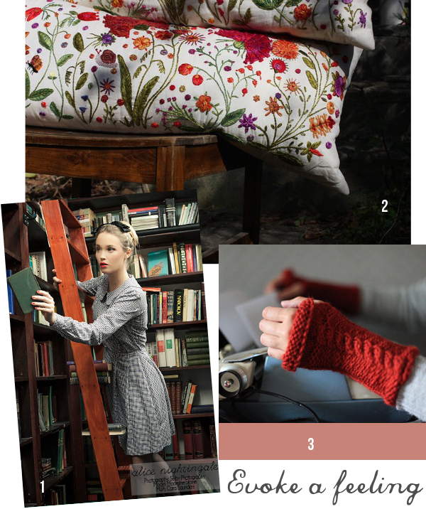
The above 3 images were selected by Jenn of Palimpsestic and I’ve decided to share all her explanations here. Not only is Jenn one of the team’s resident curators during our team’s monthly Elite16 Style Guide Challenge, but she has a knack for words and did such a great job explaining things that I wanted to make sure everyone benefited from her insight! When curating a treasury collection, Jenn says she looks for “a sense of mood – I want photos that evoke -something-, be it drama, playfulness, professionalism, or romance.” Her 3 image selections all focus on evoking a feeling which can literally set the tone for a treasury and ground a theme. For image #1 Jenn says, “The dress is front and center, but the lovely library set sells a feeling as well. This is who you could be if you were wearing this dress, and wouldn’t that be nice?” Jenn’s commentary for image #2 made me smile, “Usually putting a home decor item outdoors just serves to make me wonder how dirty the item got during the photo shoot, but the close framing of this shop, coupled with the wild floral of the pillows allows me to envision a lush flower garden in the background rather than someone’s weedy backyard. The dappled light is just right and the garden photography plays on the shop’s name, OnokWildYard.” The last image comes from fellow team member Hannah’s Etsy shop Let’s Backtrack and Jenn notes, “I love all of Hannah’s photos, but this one is particularly goodbecause the bright color of the arm warmers stands out so perfectly against the background. The props are neutral enough not to get in the way while their vintage beauty reinforces the old-fashioned feeling of the shop. I also love the subtle wallpaper background. Again, she’s selling a daydream as much as a bit of knitting.”
DID YOU TAKE LOTS OF NOTES?
We’ve covered a ton of ground here and I hope you’ve found the information to be useful and informative. I thought I could get all the information in this second post, but I’ve decided that there’s enough information for one more post! That’s means next month, I’ll be focusing on photography advice from our team of experts – definitely stay tuned! If you have any further questions, I am always happy to help so please leave questions or comments for me below. If you’re an Etsy shop owner and have additional bits to offer, by all means leave a comment and share your knowledge!

[…] Feature Perfect Etsy Shop Product Photography […]