Thanks for joining us for the social media branding mini-series. This week we’re going to bounce over to Google+.
Since creating images of a specific size isn’t all that important with Google+ (all of the elements are dynamic) we’re skipping the video + template this week. Not to worry, there are lots of other goodies waiting for you!
Let’s start with the basics: image sizes. Again, these images are going to resize automagically depending upon the device / resolution of the visitor’s screen, but we’d recommend using these sizes as minimums to ensure quality aesthetics.
- Google+ Cover Photo: displays at 2120px by 1192px (or 16:9 ratio)
- Google+ Profile Photo: displays at 270px by 270px (cropped into a circle)
- Google+ Shared Images: variable, but display at 344px by XXXpx in feed
- Google+ Shared Videos: variable, but display at 344px by 260px
Tip: Your cover photo will appear with a gradient overlay at the bottom, similar to the Twitter header image. Just be aware of this fact when selecting your photo or designing an image.
No idea what to use for your cover image? Take a peek at these creative Google+ accounts for some inspiration:
Lu & Ed‘s creator, Cody Nations, uses Gabos (the brand’s mascot): a perfect choice for this kid-centric, eco-friendly brand. Gabos, aside from bringing an instant smile to your face, reinforces the brand!
The Petit Cadeau‘s Alison Butler tells the story of her brand with a clear photograph of delicately wrapped gifts. Not only is the picture speaking to The Petit Cadeau’s mission, it’s creating an emotional response in the viewer. Connection!
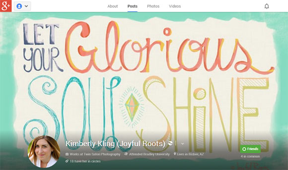
Joyful Roots‘ Kimberly Kling is spreading her message with one of her inspirational illustrations. Full of color + personality, her cover image is a great way to showcase her work. Inspired visitors = return visitors!
In addition to the cover photo, you’ll have the opportunity to upload images directly to your feed. Use them to your advantage, get creative, and have fun!
We tested out the display size of shared images + discovered that G+ has gone by way of Pinterest. There doesn’t seem to be height cropping anymore!
Our test image was 344px by 744px + the entire thing was visible in our feed. When viewed as an individual post, however, the width of the feed changes. So, we tried again. This time with a 504px by 744px image. Perfection. You know, if perfection is not having empty space on the side of your images in a Google+ feed. (For us it is. Darn OCD tendencies.)
Now that you’ve got the know-how to make your G+ page look fantastic, you can really make it work for you.
Nota bene: We are by no stretch of the imagination Google+ pros. We’re still learning (in between Facebooking, Tweeting, Pinning, Instagraming…) how to best use this growing platform for promotion + connection. But that doesn’t mean we can’t share some really great resources from folks with G+ degrees. Check out awesome guidelines + ideas:
- The 2013 Google+ Marketing Guide
- Google+ for Business (Be sure to check out the resources section for some useful downloads. They’re free!)
- The Ultimate Guide to Google Plus Posts from Martin Shervington might just make your head explode with information…but at least it makes sense! (Seriously, this fellow knows his stuff!)
Feeling overwhelmed?
Wait! Stop! Don’t run away screaming about yet another social media platform. Don’t give in to the overwhelm. Just remember what Dr. Martin told Bob…and if Google really doesn’t float your boat, don’t +1 it.
If you are on G+ (or head over there to open a page today), please add us to your circle…we’d love to join you + support / share your work!
See you ’round!

P.S. Be sure to check out Part 1 (YouTube) and Part 2 (Twitter & Pinterest)in this series and come back next week for the last installation of social media branding for indie biz! Please let us know in the comments if you have any questions about designing for Google+ or if there is anything you’d really love to see covered during this series!


[…] 22, 2013 by Matt + Darice / Leave a Comment This post was written for Oh My! Handmade Goodness, a one-of-a-kind handmade community. Please join us over […]