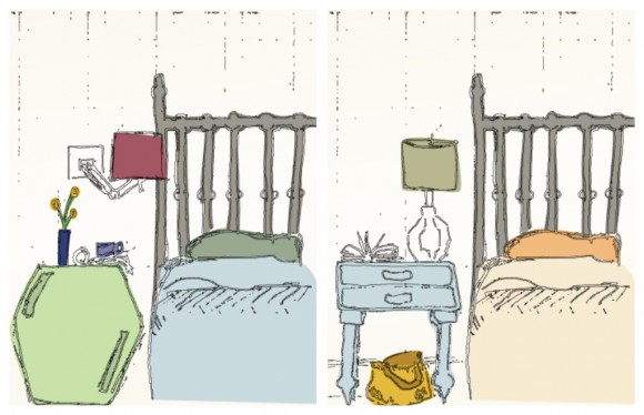
It’s said that true classics never go out of style. In fashion, the true basics, when made well, will be wearable no matter the current trends. In home decor, a beautiful iron headboard can handle years of taste-changes, weathering different styles of rugs, art, and bedding.

The same is true of other kinds of art and design, I think. As with anything, design trends come and go (chevron patterns, anyone?) but there are some classic elements that endure without feeling aged or overdone. My two favorites?
1. Typography

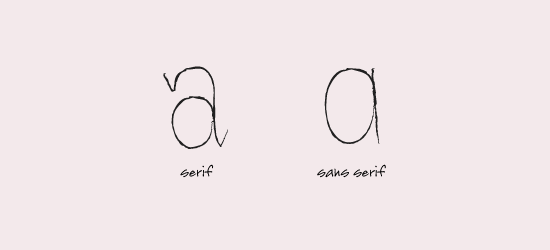
Good typography never goes out of style. Yes, there are trends in typography. Yes, it’s possible to choose a terrible font for any given project. However, a solid understanding of the basics of typography (serif vs. sans serif) and a willingness to do a bit of research into historical uses of various typefaces can get you quite far.
Just think – the style of hand-lettering you see on those great chalkboard menus at the coolest of sidewalk cafes hasn’t changed much in decades. How’s that for longevity?
2. Clean Forms

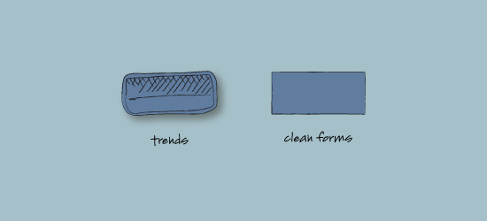
In recent years, web design has gone through a phase. It’s been all shiny-looking buttons and gradients and drop shadows, oh my! Yes, there are good uses for drop shadows. Yeah, I kinda get why shiny-looking buttons felt so modern, at least for awhile. But now? They’re on the way out.
The point is, know what’s trendy but use it judiciously. When in doubt, stick with clean forms and smooth lines and let the content rule.
What’s a classic in your field, something that never goes out of style?

