 Hello hello! Arianne here. I just took an extended maternity break from everything, including blogging, but now I’m back in action, and ready to take part in our handmade community again! As soon as I got back to work with my web design company, Aeolidia, I jumped in with both feet, and found a bunch of talented new designers and developers to add to our team, and we’ve been hard at work on lots of great new client projects.
I have really been enjoying watching the logo process on some of our recent projects, and I thought it would be fun to follow one project through from start to finish to see how a logo is born. If you’ve been thinking about having a logo professionally designed for your business, you may be understandably curious about how a designer can take your words and ideas and translate them into a logo that represents your company, is unique and memorable, and that appeals to both you and your ideal customer.
Our business personality is fun, stylish and elegant. The logo should appeal to a wide range of people, but mostly to females who are mid 20s-50s. These females are home sewers and have a middle to high income. They sew for themselves, their family and some sew for their craft business.I would like the logo to be quite contemporary with complimentary colours. My preference is for bright colours. I would like a font that is easy on the eyes and doesn’t make it hard to work out that it says “lucky lantern”.
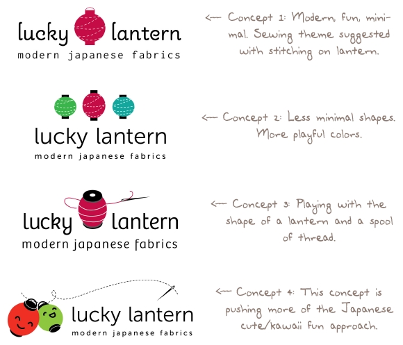
Tracy spent a while working on sketches and ideas, and for the first round of logos, presented three options. Each option had a few font choices as well.
Round 1
Round 2
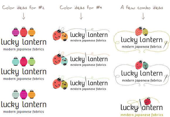
Round 3
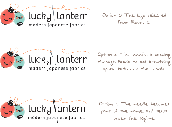
Ta-da!


