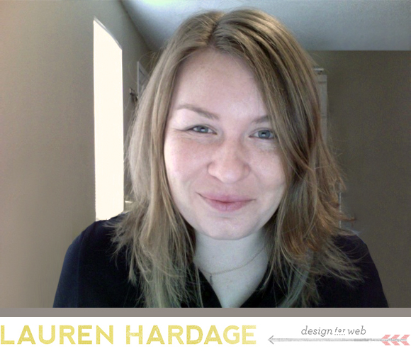
Hello hello! Join me today for an interview with Lauren Hardage. Shoshanna and I were happily working along as Aeolidia, and one day Lauren emailed me checking in to see if we’d like to hire a web designer. I hadn’t considered adding anyone to our team, but I’d admired her work for years, so I went for it! Best decision ever! Not only does she create amazing sites (that I consider to be the essence of the Aeolidia aesthetic), but she was able to pick up all my design slack during both of my pregnancies and maternity breaks, and has turned out to be a great person to bounce ideas off of as well.
Tell us a bit about your start in graphic design and Wise Rabbit on Etsy.
I started out selling woodblock prints and cards on Etsy when it was only a few months old. In the banner area, most of us newly minted sellers would just upload a product photo in the whatever dimensions and hope for the best! Maybe if you were really professional, you’d figure out how to squeeze in a pixelated shop name over the image. (Fancy!) As I spent more time learning about the community, I noticed that there were a few sellers with pixel-perfect banners and avatars, making their products seem about 100 times more legit than those of us with sad looking graphics. One night I stayed up with the Paint program open on my little laptop all night and churned out something like 80 banners! Once I started clicking around, I was just hooked. I felt all the same satisfaction as when crafting with wood, paper and ink, but with an even purer and faster translation of the layout in my mind’s eye to a visible result.
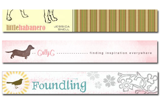
Best of all, I knew that there was a distinct need for this type of work on Etsy, and I became intrigued by the idea of serving businesses rather than consumers. I was so inexperienced and timid — my first custom banner listings were for $4.99! Fast forward five years: I’ve had the luck and privilege to work with hundreds of clients, collaborate with brilliant colleagues, develop my skills and tools, and stay busy all day long doing what I love.
How do you get started on a web design project? After you’ve read up on all the client’s info and preferences and you sit down and roll up your sleeves, what steps do you take?
First I set up a new Photoshop file that includes a folder of goodies I’ll likely need for the design. (Things like layers for the site body in various widths, placeholder text in web safe fonts, cursor graphics to show sample mouseover actions, standard copyright text, etc.) Then I pull all of the project assets into that file and hide it away in a folder, to draw from throughout the process. Sort of like getting all of your ingredients in place first, so you don’t get halfway through making cookies and realize you have no vanilla. The worst! (Fun fact: I recently read on a favorite blog that the name for this approach is “mise en place” — see here). I love this.
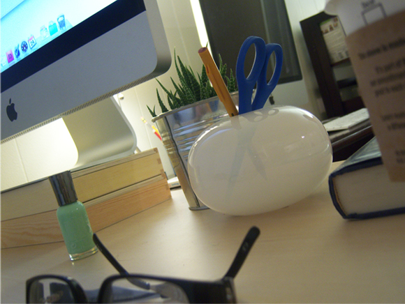
Next I re-read any design direction and inspiration, and review the graphics I have to work with, which usually gives me some kind of visual anchor to start with. From there its just a domino effect of one design element leading to the next, until the site feels attractive and balanced, and all the objectives are fulfilled. The most fun and also most nerve-wracking part is “the reveal” when you send a first look at the site concept out to a client and are waiting for a response! Knowing how much blood, sweat and tears the people I work with put into their businesses, it feels really special to be a part of getting their work out to the world — and I want them to be thrilled with the design.
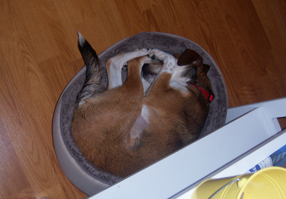
While I’m working, I LOVE listening to old time radio shows (The Whistler is a great one!). There’s something about those old continental accents and quirky turns of phrase, along with the elegant, slow-paced plots that I find totally appealing! Good hot tea (black, please — in endless supply, please) is also essential. A sleeping dog in the house is preferred, though optional. If the dog is dream-running and making any cute sleep shnorfels, this is ideal.
When you have a case of designer’s block, how do you clear your mind and get inspired again?
I usually go for a long run to clear my head… Just kidding! I wish I was that person. If I am really having a hard time getting started, I’ll look through my set of bookmarked site designs and illustrations that have caught my eye. Within the first few minutes, I will find an interesting color or font to light on, which gets me back into Photoshop. But this only happens a few times a year; a bigger problem for me is when I’m plugging away, but notice that I’m spending way too much time on each task. When I start to get that flat, grayed-out brain feeling it usually means that I’m not working efficiently and I need to take a break and do something different. Things that make me feel more like myself are: getting out of the house to a coffee shop and writing up some Morning Pages (see The Artist’s Way by Julia Cameron), people-watching, planning dream trips, interrupting my sister at work with persistent texts, pondering my list of life and yearly goals (this always makes me feel like kicking butt!), power napping, and if I really need a boost, I’ll hit up the local beauty school for a $12 never-know-exactly-what you’re-going-to-get haircut! That one really puts you in a new frame of mind. This month, in an effort to feel less like a cartoon floating brain in a jar — I’ve started taking a rowing class down on the lake a couple times a week. Truth!
Do you have a project in your portfolio that was a dream project to work on? Tell us a bit about what makes you proud of it.
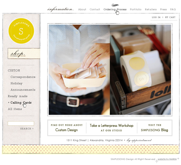
I really enjoyed working with Suann Song of Simplesong Design. She brought a beautiful, timeless logo to the project, had some exceptional product photography for me to work with, and knew her business so well, the site really designed itself. I guess I’m proud of it because I really admire Suann’s work and style, and am pleased to have been able to create something that I think complements the work well. I also like it because it’s pretty minimalist and spare, without losing any warmth or texture.
What can clients do to make a project go smoothly and get the beautiful site design they’re looking for?
What a good question. Here are some of my biased ideas:
- Do bring great content to the project. Starting with beautiful, consistent product photos is the best of all. Images that make your work shine will not only make a more beautiful site, but will do a lot of the talking for you during the design process. If your designer is able to glean a lot of information about the best look and feel for your work from the photography, it saves you from the pressure of having to articulate exactly what you want.
- Do link to site designs that you adore, but don’t ask your designer to reference any specific elements too closely, and don’t fixate on one site inspiration in particular. Keep exploring and have an open mind. There will be an end result for your project that’s totally unique!
- Do trust the process! Many projects reach a foggy point in the middle somewhere, where you’re over the initial surge of enthusiasm, but you still feel far away from the launch. Don’t feel discouraged or start doubting your choices; this is temporary. Stick with your intuition and keep moving forward. The launch will feel sooo good!
- Do keep your visitors firmly in mind when you’re planning the site and giving feedback. It’s tempting to treat your website as a sort of brain-dump for your whole artistic empire! But remember to think about what is really relevant to your visitors and your business goals.
- Do give your designer impressions of which parts of the mockup you like/dislike based on how they meet your stated goals, but don’t send a punch list of very specific change requests. Leave the designer some executional freedom to offer solutions that you may not have thought of and do the work you’re paying them for! Chances are that the end result will have better flow and functionality if the revisions are filtered through your designer’s experienced point of view.
- Do err on the side of keeping the design simple and intuitive! When in doubt: leave it out.
(Doesn’t this remind you of Goofus and Gallant from Highlights? Gallant has great photography…!)
Do you have a schedule for work – i.e. work hours, scheduled time off, etc.?
Well, no! As much as I love planning and organizing in general, I have never been able to implement a routine for myself. I am always looking for tips and tricks to achieve this and subscribe to many blogs with this theme! Right now my philosophy is just — go as hard as you can! Since we don’t have kids, I have the luxury of being able to work late and catch up on sleep whenever. zzz
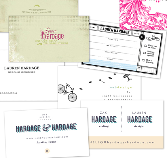
You work with your husband as a design and coding team (see Hardage & Hardage). Do you have a system? Have you learned anything valuable about working and living together?
Yes, tons! When we started working together full time, I was worried that that we would quickly kill each other being in the same smallish apartment all day with no reprieve. But instead it’s really been a dream come true. We are lucky! We buoy each other up when we’re having a hard day, and motivate each other if we’re feeling lazy or draggy. We are both believers in the idea that you have to have big blocks of uninterrupted work time to get deep into a project (see Why You Can’t Work at Work). We use what we call “Code Blue” when we really need to focus. Code Blue means totally quiet, no quick questions, no sign language, no talk at all until a set time. If you want the other person to change the thermostat that’s right by their desk, too bad, you have to get up and change it yourself! Let them work!
Also we have little rules like “No Ghosting,” which means no gazing over the other’s shoulder at what they’re working on — it’s annoying! Best investment yet: noise canceling headphones. A private office space on your head if you don’t have the square footage. This works great since Zak likes working to music and I can’t. (Wow, our office sounds strict and quiet and boring!) Another thing that we’ve found helpful is ordering lunch out when we want to have a strong work day. It’s a splurge since our kitchen is about an arm’s length away from the office, but it’s worth it — it feels like a treat and no one has to stop to do prep or cleanup. For short business meetings about specific current projects, we take the office outside and talk while walking the dog. Big picture talk calls for a “business lunch” at Pei Wei. Another lifesaver: take a separate weekday off every once in a while. We used to stress about making all of our time off time together, but now we love taking personal days to relax and get errands done, leaving the other with the office to themselves for a while.

