I am so excited about today’s post!!!! Random.org picked comment #54 from Beth of Jus Shar Designs to be the winner of our first ever Community Critiques post! Beth wrote:
16 years is a long time to be nursing any baby and I’m hoping we can help Beth wean her biz! I’m happy to be able to offer Beth my loving thoughts and open the critique up to our community to share their insight and suggestions. Jus Shar Designs sells knit and crochet accessories and home decor items handmade by Beth in North Carolina. She’s been selling on Etsy since 2008 and as she mentioned in her submission, she feels like she is running in circles trying to get her business off the ground. She has built a sizeable following on Twitter and a presence on Facebook but this isn’t converting into sales. Beth also mentioned that she doesn’t feel there is any consistency in her business and doesn’t know where to start.
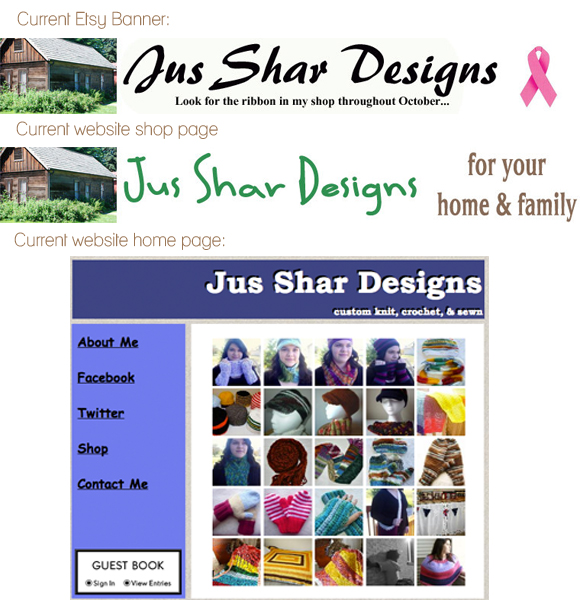
We are going to start right there! In real estate selling might be all location but in visual branding it is consistency, consistency, consistency. If you want to take your business from hobby to money maker you need to frame your product and story in a package that is recognizable to your market and that reflects the core of your brand. Currently Beth is using a different font, graphic, and colour palette for each of her pages online. This is confusing to buyers and might be a part of the reason why her social media following isn’t connecting with her products. Let’s take a look at Beth’s Etsy banner, website shop page and homepage today (you can also check out her Twitter and Facebook pages to help you get a complete picture of her brand).
So we’ve identified an area of Beth’s business that could use support-she needs a cohesive brand identity. Now we’re going to help her break down the steps to transform her visual brand. Keeping your fonts, colours, and graphics consistent across everything-from your website to your business cards, automatically gives your business a professional look and competitive edge. In order to decide on a look Beth needs to go adventuring to identify the heart of her brand (luckily Lisa of Moxie Pear can help with that).
We’re going to pretend that Beth has given me 5 core brand keywords:
- Handmade
- Feminine
- Whimsical
- Fibre
- Cute
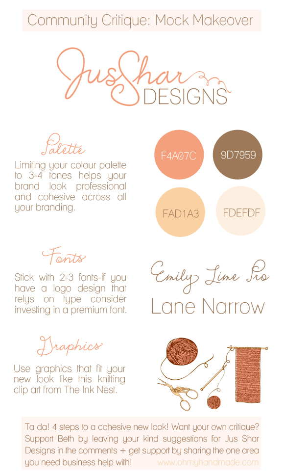
I’ve always been a visual person so going on this I’m going to create a mock brand for Jus Shar Designs that will help showcase Beth’s work and set the stage for the rest of the work to be done. Here are my 4 foundations for a cohesive brand:
- Recognizable logo that reflects the brand’s core values.
- Consistent colour palette & tone for visual branding (this includes photos!).
- Carefully chosen fonts that are in line with the brand values AND current design trends without being dated or trendy (Zoe’s got you covered here if you need some lessons in font basics)
- Graphic elements that complement and reinforce the overall branding & help tell the story. For this mock up I used these designs from The Ink Nest.
Want to see those elements in action? Here is an example of what Jus Shar Designs new Etsy banner could look like:
Of course even with a foundation of a strong brand identity the work doesn’t end! I would suggest Beth chart a timeline for the next six months that begins with setting a relaunch day and putting her shop on vacation (what?! yes! brilliance doesn’t happen overnight) for at least a month. She can connect with her online community while she works hard at getting to the heart of her brand and pulling out her key words, developing a guide like the one above to define her brand identity, and creating new visual branding (either DIY or hiring help). I would suggest taking time to set a budget for the relaunch that can be anywhere from $100-$1000+ and then deciding where to invest it strategically.
To take it even further Beth could do some research into current market trends and styles then pull together a curated line of 16 pieces for the relaunch that includes elements of the colour palette chosen for the rebrand. Limiting the launch collection to 16 items will help Beth focus in on taking new photos for that selected line and crafting her product descriptions with care while keeping the new shop looking stocked. The photos should play off the new design to further tell the story; like this, or this if you have no model, or even this if you want to get creative. They don’t need to be professional photos but the best image always wins so aim for bright, well lit pictures that are, you guessed it, consistent throughout all your listings.
I know I just handed poor Beth a few months worth of homework and now it is your turn to give and get support! Share your kind & loving feedback for Beth and Jus Shar Designs + your ideas for how she can make her brand more cohesive in the comments. If you want to enter for your own critique also share the one area of your business you feel needs support. Remember, no criticism, only kindness friends! Big hugs and hoorays for Beth being brave enough to let us look at her business so publicly, thank you! I can’t wait to see how this baby of yours grows up!
I will draw a random winner from the comments below for our next community critiques post on November 19 with the next post published November 29th. You can get more details on how our critiques work right here.
Happy commenting!


