There are such a large variety of business cards that you can choose from to represent your brand at an event or conference. I thought the best way to feature them all was to group them by kind: recycled cards, glossy cards, satin matte cards, letterpress cards, rounded corner cards, die-cut cards, enveloped cards, and business cards with free swag. I’ll talk about what makes each kind of card unique, its design qualities, and the benefits of using them at a conference.
Recycled Content + Matte Business Cards
I wouldn’t throw out the idea of a matte card just yet… a matte card can create that earthy, home-grown look for your brand or it can give you a chance to showcase your typography skills using a super minimal layout to match the no-fuss look of the paper stock. It can great for brands that focus on vintage, journalism, and organic. It also looks great with a spot varnish. One nice touch for matte cards is that it lets you easily write on the backside to leave a note to the person you’re giving the card to. It’s also very easy on the budget.
Glossy Business Cards
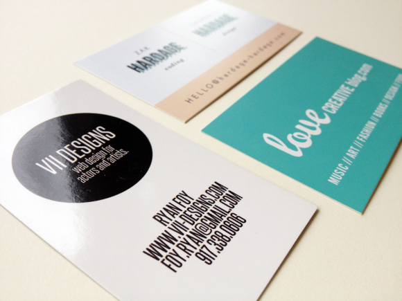
This was a large group for sure and glossy is what most think of when you say “professional business card”. I will say that their biggest down-fall is being super slick, literally slick. I’d suggest having only one side be glossy and the other side matte to avoid they flipping out into the air like a new deck of cards. And rubber-banding them together isn’t too attractive either.
Now if color matters the most to your design, then glossy will give you the truest color to what you see on screen. Rich hues, great contrast, and very vibrant. Notice most of my examples here have black as the main color or one of the prominent hues.
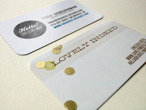
Satin Matte Business Cards
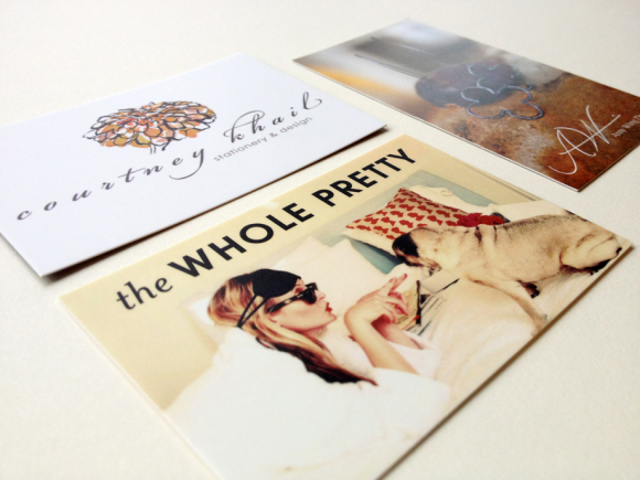
This is without a doubt the most popular paper stock for business cards this year. And I can see why! The ultra-smooth and suede-like feel of these cards are addictive to touch and the soft gloss effect seems oh so luxe.
However, they do have a hard time giving a true color match so if you’re brand colors are vibrant or graphic-heavy, a gloss would be better suited for you. Photograph cards, on the other hand, can really “glow” on a satin matte.
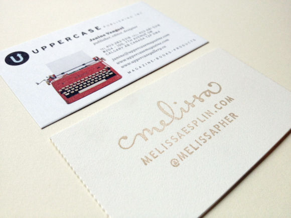
Letterpress Business Cards
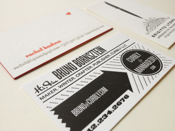
What’s more fancy than a die-cut card? Try hand-printed goodness on thick 4-ply papers that sport a organic texture. I don’t often see this kind of card floating around—probably due to their cost and limitations to using just text and graphics. If you love the textured touch but don’t want the letterpress cost, you can still have your card digitally printed onto thick cotton paper.
If you’re going to a conference full of paper and design geeks, then going letterpress is how you’ll be sure to get their attention. And you’ll never feel like your cards weren’t good enough with letterpress, there’s just isn’t a paper stock or printing method that can beat the tradition and quality of this age-old technique.
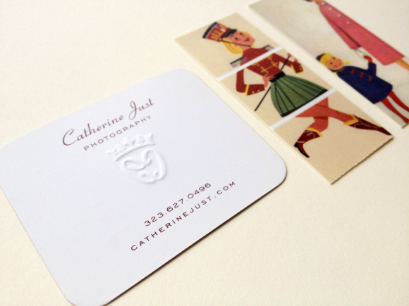
Rounded Corner Business Cards
It seems like those who love sharp corners, hate rounded corners and those who love rounded corners, hate the sharp corners. But personal preferences aside, think about if a soft touch is needed to really represent your brand. Children’s stores, whimsical brands, and those who have circles as part of their brand design can really use rounded corners to their advantage.
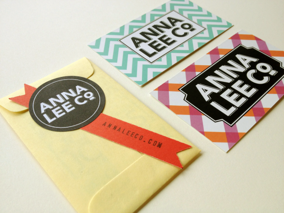
Die-Cut Business Cards
The real question with these is: do you care that your card will fit the standard sizes or does being super unique mean more to your brand, despite those who will toss it simply because it won’t fit a standard card holder. (Believe me, I’ve had people tell me this to my face when I used Moo.com’s cards, which are in European sizes.)
If going bold and unique is still more important then use pictorial elements from your brand to create the card shape or a decorative outline. Squares and long, skinny cards are just the beginning to the creativity you can unfold with die-cutting. Don’t worry about too small, the examples I have here prove that you can still get a lot of info on a tiny space.
And let’s not forget the little QR Code there… this is a perfect moment to make a landing page just for Alt attendees to visit that’s hidden from the public so you can give them a more personalized experience on your site.
Enveloped Business Cards
Seriously, what can make you swoon more over a card than when you package it up like a card? I love the idea of using mini No.1 Baby Envelope or using your own hand-cut creations using an envelope template. Stickers, embellishments, and fun color arrangements is the name of the game with card jackets and packaging cards. I really liked how one brand took advantage of this to be sure that both owners were getting their info out there by placing both inside.
Business Cards with Swag
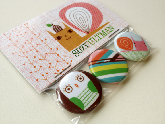
Okay, you probably thought that last section was cool enough but this next one will really blow your brain: using our cards to either package swag or include it with free gifts. It’s not only great psychological marketing (you feel obligated to do something back or buy something from those who give you something for free) but it’s a great way to get on the “Most Memorable List”. And I love how it’s more than just contact info: it’s a real treat! Using a fold over card as a bag topper is a great idea.
What is your favorite style of business cards? Feel free to leave a link to your own cards in the comments!