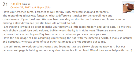
It is time for the next Community Critique! Last month I focused on how creating a cohesive visual brand through your logo and identity can make a huge difference for your business. This month we are zeroing in on investing time to create amazing photographs and showcase your handcrafted works. Natalie of Re-Wood Toys wrote in to share some great insight for Jus Shar Designs and to ask for help with her shop…
When it comes to handmade products for children, especially handmade toys, communicating quality through your photos is key to making your customer feel safe enough to shop with you. Although your product might be lovingly handcrafted if your photos don’t show equal attention to detail you’ve lost at least half of your potential market after the first click.
Before you pick up the camera and start clicking away ask yourself:
What story are you trying to communicate to your market?
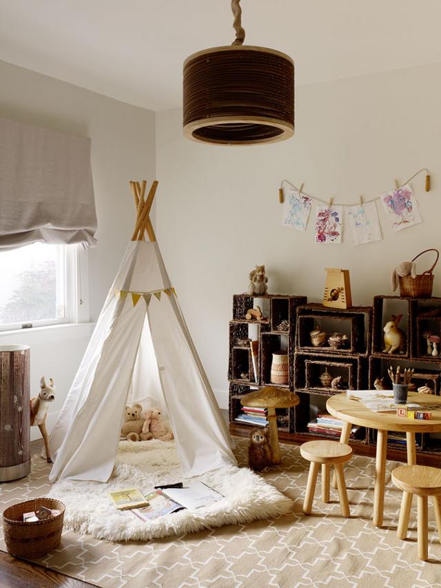
In Natalie’s case we’re going to assume that the story she wants to be telling is one about the joys of a natural childhood filled with handmade toys crafted with love and care. Here is an example of an image that captures this story perfectly:
photograph by Matthew Millman via Remodelista
The current Re-Wood Toys photos are not communicating any part of this story loud and clear, so no matter how awesome the logo or font choices, customers are going to be confused by the messages they are getting. Imagine yourself as a potential customer…a new mom, totally overwhelmed by the amount of things to buy for your baby. You’ve read lots of things about natural parenting but you don’t really know what you need. This buyer is skittish-she’s going to click into your site and out again in two seconds if you don’t give her some reassurance. As the retailer you want to find a way to relieve her fears by telling her through your photos first that your products are safe, well made, and can fit into her life. This scenario works equally well if you switch out the new mom for anxious grandparents, discerning dads, etc…
So how do you make your photos tell a story and speak to your market?
1. Get to know your market & their style
If you are selling punky wooden skull teething toys to offbeat indie parents you are going to have a different style/story than if you are marketing cheerful, gentle toys to natural parents. The first product might require a dark palette, gritty backdrops like a graffiti filled urban wall, or lifestyle shots of tattooed mamas. For Re-Wood that story wouldn’t fit but the current photos in the shop aren’t really telling us anything about their market or style! If we go on our assumption that we’re seeking parents interested in natural play for their littles we can get an idea of their style by looking at magazines, blogs, and other shops that cater to that market. Some ideas for places you could look to for inspiration are: Pure Green Magazine, SouleMama & Taproot Magazine, Sweet Paul magazine (especially notice the beautiful way Paul styles his children’s pictures!)…Hey OMHG’ers share your suggestions for Natalie to go seeking natural parenting photo inspiration in the comments!
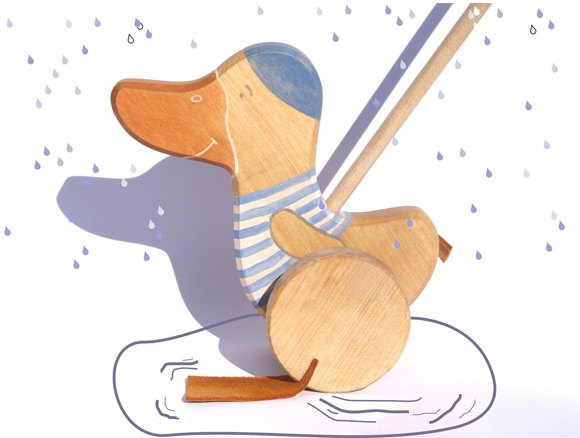
This wooden pull goose by friendlytoys literally paints a picture!
2. Paint a picture you can step into
In any discussion about good photography you’ll hear lighting repeated like a mantra. While good lighting is vital the best lit shot can’t prettify a badly conceived image. A great product photo tells the story of your product in a way that lets your customer envision it in their lives. The best of photos invoke an emotional response that connect us to the product and make us want to know more like the sweet example above. I want to see Re-Wood photos that show the toys being used by littles of different sizes; close ups of chubby wee hands holding tight to them in a softly lit room, siblings having a quiet moment of play in a window nook, a babe waving a toy while laying in a sweetly styled crib. These are the kind of images that will engage not just shoppers but editors (ahem, like me). In order to position your shop for press and features you need to give us a picture we can invite readers to step into and weave a story around.
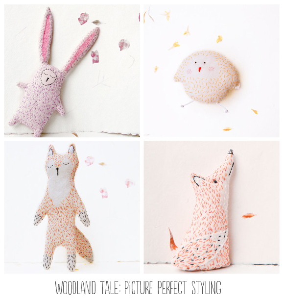
Sheer adorableness from new Etsy seller woodlandtale-I predict only good things for Kate & her shop!
3. Styling is everything
Take a couple of hours to look through the shops that regularly make it to the front page on Etsy, that have over 1000 sales, or are always being featured by editors. What is it about their shops that stand out? It isn’t just their branding because plenty of successful shops have underdeveloped brands. Almost all of them have created a narrative through their pictures that invites us to explore and want to own a little bit of their awesome. They have managed to capture their products in a way that makes us want to have them for our own.They do this by styling their pictures in such a way that they tell a story and tie into the overall aesthetics of their work. Since the Re-Wood toys don’t have colour to add visual interest this needs to be done through styling.
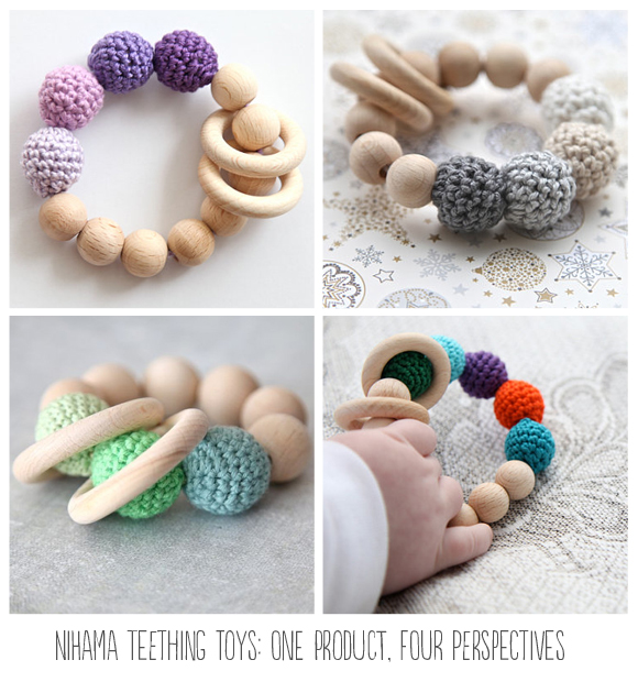
Nihamaj teething toys by Nihama-Jana Ladizenska
4. Mix it up!
You want to keep a consistent style for your shop but you also want to offer your potential customers and editors variety to choose from. It is a tricky balance and Nihama absolutely nails this in her Etsy shop! Though she has a lot of listings there are only a few products-her shop is made interesting through her use of excellent lighting, colour, angles, sweet little hands, and props. Look at how she manages to give a fresh look to the same product in the four pictures above with very little actual changes to the background. Bravo Nihama!
Here are my suggestions for Natalie to take these ideas and work them into a product photo strategy for Re-Wood Toys:
1. Improving your product photography is a process of learning, failing, and learning some more. If you commit to working on it and improving a bit at a time you’ll be amazed at how you will begin to fall even more in love with your own work. It feels good to polish up something rough and make it shine! Take some time before you get started to read your camera manual and brush up on the basics of good photography (Etsy has some great resources to get your started).
2. Set a budget for beefing up your photographs! Your budget will dictate how much you can do right now-you might only be able to set aside enough to create some new backdrops or you may be able to invest in a new camera or photographer. Remember when you are budgeting to consider how investing in this vital piece of your business will lead to sales, press, and return customers if executed well. If the photos are only marginally improved you will see less profit than a drastic improvement so budget accordingly!
3. Make an inventory of your current products and list them in order of your top selling items. Choose your top 5 products as a starting point-you can work through the rest after you have a good foundation. These are going to be your five shining stars!
4. Make physical vision or Pinterest boards for each item-be sure to look for lifestyle and product images to help you gather ideas for styling your own products. Take note of the way each photo is lit and the elements that draw your eye.
5. Brainstorm detailed photo styling ideas for each product and a list of props, models, or needs for each photograph. You are going to plan at least one lifestyle shot and one product focused shop for each listing. For example: your lifestyle styling plan for this teething necklace could be a mama & baby snuggled into a cozy rocking chair with a little hand reaching out to grasp it. Your product shot could feature the necklace against a pretty blue paper backdrop with puffy white wool clouds.
6. Set photo shoot dates and plan for them! Make sure you have your props made, your models organized, your camera ready & your batteries charged. Plan for success by having the day clear of other responsibilities so you can play with taking your photos. Here are a few extra tips for capturing great images:
- Be sure to notice your light sources and plan for shooting your pictures when the light is the best. This can be especially hard during Canadian winters!
- NO HANDS! Pretty pretty please. Unless you are modelling jewellery, showing a process shot of the maker at work, or in your case have a small bebe hand for cute factor, there should be no hands in your product photos.
- Take A LOT of pictures. Don’t just grab a couple of shots and call it a day. When I photograph anything I take between 20-30+ pictures of every shot from multiple angles. Get in close, shoot it from above, zoom in, zoom out, have fun! You can always edit them afterwards. I usually keep my computer close by so I can dump the images if my camera fills up.
7. Practice, practice, practice. If you continue to push yourself to craft your photos with the same love you put into crafting your products you will improve by leaps and bounds. My first product photos are never leaving the archives of awful but I promise you that everything I have learned was through doing it over and over again.
If you just can’t muster ANY enthusiasm for all this photography goodness then I strongly urge you to shop around for a professional to help you rework your first 5 product photos. Product photography is often quite reasonable and since you will be able to use the photos for your shop, banner, and promotional materials, it would be an excellent place to invest. Once you start to see your sales improve you can reinvest some of your profit into having another 5 products photographed for you. I would still suggest even if you go this route, to do the above pieces of making vision boards, planning photo styling, and crafting a plan for your photographer. The point of all this exploration is to get clearer on your style not theirs!
Now it is your turn friends!
This post took me forever so for December I am giving myself more time to percolate and plan! So submissions for the next Community Critiques close on Monday, December 10th with the next post published the last week of December.
Ready, set, community support engage! Share your ideas & critiques for Natalie in the comments + your experiences developing a photo strategy for your products. Nothing is better than learning from others!
Photography is one of the harest things about putting together a shop. Photos really make or break a shop. It’s one of the things that I’m really trying to improve to convoy my brand.
Your items are really great and with some work on the photos I think it would really make your shop stand out. When I think of wooden toys and kids the first thing that comes to mind is soft, warm, colors. Try using different backdrops or changing the white balance on your camera. It is a quick way to add warmth.
One thing that would some cohesiveness to your shop would be to photograph kids using the teething toys. When I first saw them I thought that they were decorations and than necklaces. It wasn’t until I really looked at the title that I realized that they were teething toys. It might be great to have a baby playing with one or a parent holding a baby while she is chewing it.
This is an excellent post and I love her toys, her pieces are great. Nicely made, sanded smooth….You have pretty well nailed the photography ideas for her. Such a make or break thing for any shop.
I struggle with that as well, so many photography help articles are written for small things such as jewelery etc. I am trying with my photos but know I am coming up short.
Thank you for the tips, even though I sell magnets and pinbacks, I’m trying to think of ways to enhance my photographs. This was finally a help, a lot of people offer suggestions on good photography-but this post went further. Thanks!
SU
Oops, I’ve broken your no-hands rule. I thought my pictures with hands (Holding three bow-ties in my palm) were cute and stylish. Oh dear. Is there a particular reason why non-jewellery sellers should avoid hands?
Also, why is it your photo tips go against everything Etsy (And the sellers) try to tell us to do? I’ve had the white background thrown at me since I started, and even though I went and asked how my new photos look (Nice sharp, white background) I STILL had people picking on my old pictures– calling them cluttered and such, even though I’ve only used matching-patterned scrapbook paper as the base.
Oh, I wish you could take a look at my shop and give me some advice, although I’m sure it would be boring to try another photograph critique so soon. I took your branding advice last time and had a blast making matching labels, hang-tags, banners, and business cards, and I’m waiting on round stickers to seal my mailing envelopes.
Hi Amber! I suggest avoiding hands because they usually don’t add anything to the story or the product-unless the product is meant to be worn on the hands it tends to be a distraction. It becomes especially distracting when it is repeated in multiple photographs. When you are styling your photographs it is a good idea to think of if the props/backgrounds you are using are adding to or taking away from the product. I’m not at all saying to not use a white background in your photographs and lots of these tips can be found in the Etsy seller handbook! Your listings should definitely aim to include one “clean sweep” picture but especially in Natalie’s case, since her products do not include any kind of pattern or colour, a solid white background isn’t going to add any visual interest. Also! You can tell a great story with a white background AND all white products-here are some examples:
http://www.etsy.com/listing/95591122/metallic-edition-10-vegan-soap-favors
http://www.etsy.com/listing/109742988/simply-modern-botanical-sachets-grey-and
http://www.etsy.com/listing/60502903/book-page-canvas-leaf
Notice the little accents in the props, the softness of the lighting & the sense of space in each picture. White doesn’t need to be boring!
Three cheers for playing with your branding & I would definitely have fun reviewing your shop. Send out your wishes to the Random.org fairies:) Wishing you all the best in your photography adventures!
Thanls so much for explaining the no-hands to me. It does make sense!
Wow, so much good info! I do agree that photos can make or break a shop, especially online. I’m still working on this one myself. The items in the Re-Wood Toys shop are adorable! I think there should be more convincing pics that shows not only the use of the product, but the warmth and feeling – that “emotional” part that will get a shopper (new mom) to buy. Add a few photos with babies using the items or even use a baby blanket “backdrop” for some of the pics.
Good critique Jessika!
Your items look like they are beautifully made and would make wonderful presents. Hopefully with some tweaking you will get the cohesive look you are hoping for!
I love the images Jessika posted; they look like some great ideas for really showing off children’s toys and branding. Looking at your shop, the photos of the little girl at playing with the pretend kitchen most caught my eye. It really gave me a very quick sense of what the toy was for. As Sam said, it is not immediately apparent with some of the other toys that they are just that, toddler toys and teething items, since they are often adult hands holding them.
One other thought it around your banner. I don’t have a specific suggestion, and perhaps it is something you are already thinking about. I do like the tree cut-out in the banner–it definitely gives the sense of a naturey brand–but since it is specifically items for children is there a way to incorporate an image that really makes this pop out to customers when they visit your shop?
Branding is definitely something I think I struggle with myself, but I think my main issue is writing descriptions and titles that really draw people in and give a good written description of my jewelry.
Photography photography photography!
As a frequent Etsy Treasury Curator – I search for and love easy to see/understand images. Especially WHITE backgrounds. You’ll notice those images always make the front page of Etsy!?
In my opinion, for selling online, a good photograph of your item has a white/near-white background – I love that your images have that but instead of stark white, they are white textures (like maybe from a pillow or a cushion) – warm soft textures babies like to crawl on!
Natalie,firstly I would like to say that the concept,design and workmanship behind your product is wonderful!I also read a few description’s and felt like you provided enough info to answer a parent or gift giver’s question’s.I am a parent of a 18 month old and am probably your target market:-) though you have a great product I feel like the visual’s and pictures do not do your product justice.Perhap’s you can inject color and a touch of whimsy in your shop banner,chose a more playful font.Also Jessika has pretty much covered all the bases when it comes to photography but I also think your product can benefit from more clear and bright background’s it would definitely draw me in more if I saw a baby or young one playing with a few of the toy’s in a brightly lit photo or maybe seeing them in a toy box or nursery shelf ,the rainbow toy is cute but perhaps if it is staged on an illustration with clouds or a pot of gold:-)or the little school bus staged with little lego people to inject color and whimsy I wish you all the best! I also struggle with pretty much everything ! and have been working constantly on photo’s SEO and all that good stuff ,my biggest concern is I am not seeing sales and could really use constructive criticism as to what I am doing wrong.
As I look at all the items in your shop, I imagine little elves hard at work and singing while they sand and polish. Your products are lovely and there are just so many. Wouldn’t it be wonderful if just the making was enough…but that is the easy part for me. The work is in the presentation and getting your message out there. A few thoughts.
I would like to know more about you. What compels you to do this amazing wood work aimed at the sweetest among us? Tell me your story. Tell me why.
Jessika is right on with the ideas for photography. This is a challenge for me as well. I love the idea of getting to see your product in a creative way using backdrops. Because your product is not colorful, pastels would soften the hard look of the wood and add to your story.
I would love to see rounded prices. I do not know why, but when I see prices I can’t make sense of, that end in 28 cents or something like that, It does not look professional to me.
As for me, I have put a bunch of time, thought and money into my website, but there are not many graphic components to it. There are lots of pictures and copy. Could I tell my story better with more whimsy and handmade graphics without making drastic changes?
Natalie, what a great product line! It seems that you are off to a good start. Here are my thoughts on your website. On your home and about page, I would put the image above the text. I was looking at your site on my laptop and if I hadn’t scrolled down I wouldn’t have seen them at all since they were “below the fold”. I feel like people can fall in love with your product much faster through images than text. Once you’ve got their attention then they’ll take the time to read more about you.
On your Etsy listings, maybe think about showing the items from different angles on the same background. I love that you show a packaging shot. It’s especially helpful if someone is having their purchase sent directly to the gift recipient. But I think it would be more cohesive if you put it on the same solid background that you pick for the product shots. Throw in some of the lifestyle shots that Jessika suggested and I’m sure your product will be flying off the shelf!
This is the best post of I’ve read on product photography. All the time you put into it was well worth it, Jessika. As someone who is trying to improve my product photography and ecomm sales, I feel like you’ve given me plenty of food for thought. I think my biggest problem is that there is a disconnect between how I view my product line and presentation and the way other people see it. I would love to know how it comes across to others (in terms of style or target audience.) There isn’t an “ideal” style that I’m striving for but once I know where it does fit in, I’ll be better able to connect with my target audience.
The best pictures in your shop , to me, are the ones of the wooden kitchen, where you have a little girl playing with it. You could even add extras of little knitted food to tell the story of playtime. I think it would adorable. Even the doll house- I want to see pictures of the doll house in full furnishing.
If you ever need someone to make some knitted items for you, I’d be glad to help out!
Thank you everyone for such amazing feedback. Apparently, we were not getting the updates and missed this wonderful post when it came out!
I love all the ideas about photography. It is something we struggle with. My husband does all the toy making and I do all the promotion, marketing, shipping, etc. We also run another retail shop, so time is so valuable to us. Glad to know that photography is where we need to focus.
I have been using the white backgrounds because as Amber already suggested Etsy suggests using white background. When checking out other businesses that sell similar items they all have stark white images and their sales are extremely high (such as Little Sapling Toys or Smiling Tree Toys). I could definitely approach from a different angle and I think it would separate us from these two businesses.
I will consider changing the banner. Again, we are so basic right now. We are not ready for a rebranding as we just chose this logo not too long ago (it took forever for my husband to approve one!). We just had new business cards, tags and shipping materials printed with the logo. But I do agree that nothing in the logo represents babies or children. I will think bout some ways to revamp.
@Colleen, my husband and I run a natural parenting store in our hometown and it was really a lack of natural wooden toys made locally that sent us on the woodworking path! Our necklaces is really where it all started, I wanted a natural solution to the typical Teething Bling and I figured my husband could give it a go. From there, it started to sell like wildfire. My dad is carpenter, so having been around machinery my entire life, it seemed natural and easy for our current family to embark on that path. My father passed down some tools to my
husband, gave him a few tips and then we were on our way!
My husband will be leaving his full time position in August of this year to pursue his woodworking full time and help me with our retail shop. This is such wonderful and thoughtful advice that will help us achieve our goal! I am so happy to have received this review and so glad that it came early (we now have 9 months to rework our images!).
Thanks again to everyone for your thoughts and especially Jessika for taking the time to review our site. I will be in touch once we start to revamp our product images to check in!