A special guest post by Julie Gibbons of http://tractorgirl.com.au.
I love pattern! My fabric stash is full of it, and one of my favourite things to do in my own applique work is to combine two or more fabrics to create fabulous contrasts. There is a definite skill required in judging which ones will work together, and which ones will not. In my years as an art teacher, I found a set of tools and methods, sometimes referred to as the elements and principles of design, that are a great guide in learning how to work with design. There are some crossovers in the ideas contained in it, and you will find that each element or principle rarely works in isolation. Nevertheless, they are outstanding guides.
In your toolbox, there are the elements of Line, Size (Scale), Direction, Shape, Texture, Tone (Value), and Colour.
The methods you can use with these are Balance, Gradation, Repetition, Contrast, Harmony, Dominance, and Unity.
Now I won’t get stuck down too much in the theory, but I will try and demonstrate how these elements and principles get used with some real examples. The patterns I have used are all fairly busy and distinctive, in order to get you to think about them, but of course you can combine one busy pattern with something much plainer to excellent effect. By the way, all these fabrics are either vintage or remnant pieces from my personal stash – so I have no idea who the designers are!
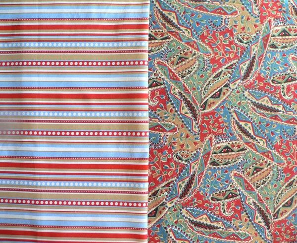
{Pattern 1 – red/blue stripes & red/blue/green paisley style}
A lot of the time, colour is the major element that will tie together two different patterns. However, it usually doesn’t work so well unless there is at least one other element (e.g. line, tone, or scale) that is similar in both patterns. In the above combination, there are similar colours used – red, blue, and ochre, but also the size (scale) of the patterns are similar – the paisley shapes relate to the stripe width. Tone is also similar, showing areas of flat colour with clean edges. With these things to tie together the two patterns, the contrast of the simpler geometric against the softer, rounded and randomly placed shapes works well.
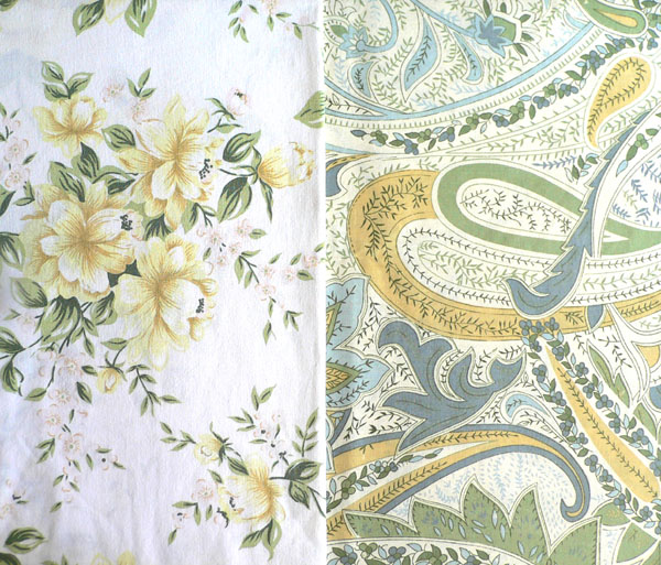
{Pattern 2 – soft yellow floral & large blue/sage paisley}
You might think that because these two patterns use similar colours that they would work together OK, but they don’t really. The overall scale of each pattern is fairly similar, but the problems are mainly in the tone. The floral uses tone to create a semi-3D effect and a sense of depth. Further, the edges of the flowers are defined by their background, rather than any specific outline. The paisley on the other hand, uses flat colour, which is clearly defined by line. Line is also used quite a bit in the paisley to provide detail, and it therefore creates a much more detailed, denser pattern than the floral. Overall, you could probably push these two to work together, with other patterns/colours/textures to break them up, but it’s not my favourite combo.
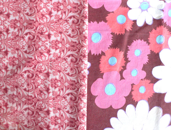
{Pattern 3 – crimson/pink damask print & crimson/pink floral}
Again, the colours are fairly close, but the overriding elements in these patterns are scale and line, and they are very different. The visual textures are very different too – big flat areas of colour, versus lots of tight, curly detail. Definitely not a good match.
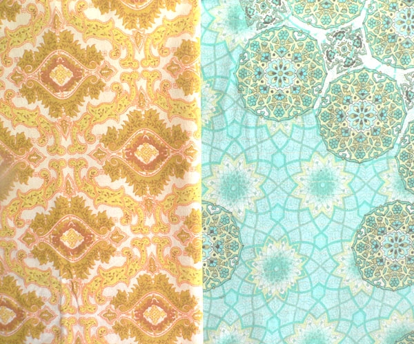
{Pattern 4 – Yellow/ochre damask style medallion & aqua/turquoise print with Moorish-inspired motif}
Here is a lovely example of quite different colours and patterns working well together. Colour is still important here – but because of the contrast, not the similarity. While the tones in each print are quite clear (i.e. not greyed or murky), the biggest two correspondences here are scale (the medallions in both are of similar size), and line (arabesques and geometry both play their part).
It’s important to understand that the elements and principles of design are not hard and fast rules; they are guides only. For every combination, it’s a matter of looking at each pattern’s most dominant features, and seeing what they correspond to or contrast with in the other pattern. It is also a matter of context – it depends on what purpose you’re using them for, and also on what else you’ve got to go with them and around them.
I hope this has been a useful introduction. If you want more information on how to incorporate the elements and principles into your designs, I have just started writing a series about them on my blog, looking at each in more depth. The first one published is about Texture.
Now go and have fun!
About Julie
Julie Gibbons is tractorgirl, a maker of homewares and accessories, and a lover of colour, texture and pattern. She completed her PhD Fine Arts in 2001, majoring in Silversmithing, and now she blogs about contemporary craft, surface design, food and books at http://tractorgirl.com.au.

