Is it really already September? If you read my previous post Feature Perfect: Etsy Shop Product Photography back in May, I had all intentions of writing this post here to go live in June. Yet, somehow it’s no longer June, is it? Well, for those of you who have been following my posts, starting with Grow Your Etsy Shop with Treasuries, this is the last post in the series and I’ll be sharing insider photography tips for new shop owners. However, the information will be relevant to new, somewhat new, and not so new shops as we can always use inspiration when it comes to photographing our product! I’ve got loads of information to share, so let’s get to work!
Once again, I’ve tapped into the extensive knowledge base of the treasury team Elite16 that I co-captain with Amber of Red Tile Studio. This month, we’ll be hearing from 2 new voices: Cinne of Etsy shop by Cinne Worthington and Jillian of Jillian Rene Decor. We’ll also hear from our usual crew: Caroline of Dark Ride, Carolyn of Romy & Clare, Jenn of Palimpsestic, Anna of Studio by the Forest and Lauren of The Haunted Hollow Tree. The answers that they all provide are not based on reading the Etsy Seller’s Handbook, but on real time experience. In my opinion, this is value packed insight you don’t want to miss out on! The main question this post will focus on is, “What photography advice would you give a new shop owner?”. I will also be covering Cinne’s shop and Jillian’s shop more in-depth as I feel they both illustrate some crucial key points in terms of shop photography.
FOCUS :: Cinne of Etsy Shop by Cinne Worthington
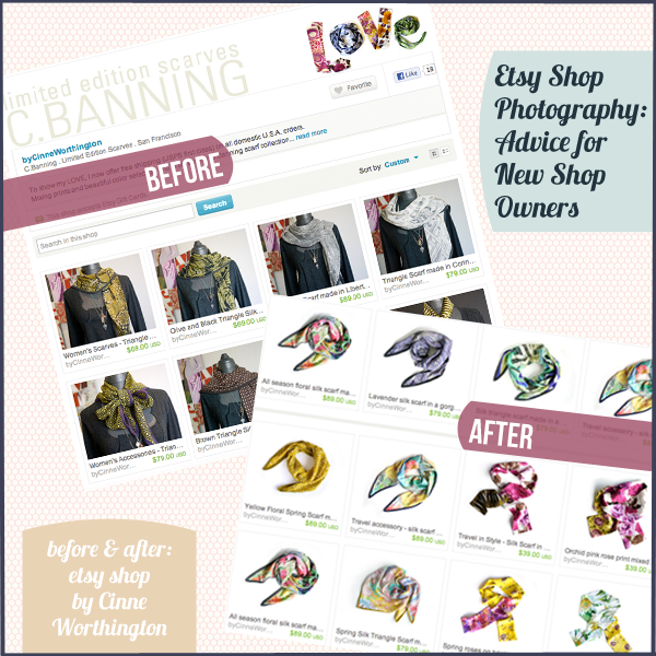
Take a look at the image at the top of this post. It lays out a snapshot of Cinne’s shop by Cinne Worthington before and after she updated her product photography. I chose to highlight Cinne’s shop because of the dramatic changes that her shop underwent in order to make her product more treasury friendly. In the before images, Cinne was showcasing her beautiful silk scarves on mannequins in a busy setting. Before Amber & I brought Cinne onto the team, we asked her if she’d be willing to update her item photography to reflect a cleaner look where her product was more visibly marketed. She jumped right in and the difference is striking!
For this blog post, I asked Cinne the following question, “What have you learned from changing over your product styling?” I’ll record her answer in full as she touches upon some wonderful points:
My first product photos were all done on a dark mannequin in front of a black backdrop. I wanted my photos to reflect the high-end elegance of silk scarves. What I ended up with was an evening wear look which didn’t fit my product at all! Best advice I’ve received (thank you Nanako & Amber) was simply to photography my scarves on a white background. Simple clean pure product shots make my scarves easy to add to ones wardrobe and to treasuries. If someone is looking for a yellow floral scarf, then show them your yellow floral scarf and make sure the photo is clean and crisp and as true to life as possible. Since I reshot all my scarves on a white background they have been featured regularly in treasuries (only made it into 2 treasuries with the “evening-wear” series). In fact just about every one of my scarves has been featured in at least one treasury. Seeing how other merchants build treasury collections/style windows has allowed me to understand my product and my customer so much better!
Learning from a fellow shop owner’s direct experience is very potent and has a lot to offer, so thank you for sharing your process with us, Cinne! Next, we’re going to take a stroll over to Jillian’s Etsy shop to see what gems we can uncover there!
FOCUS :: Jillian of Etsy Shop Jillian Rene Decor
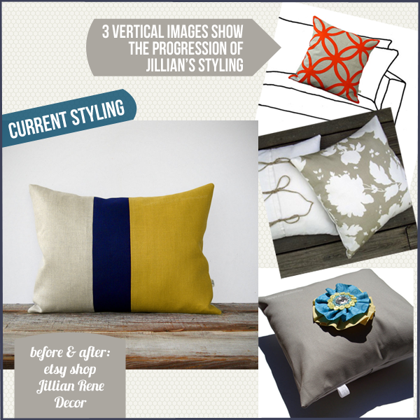
I’d like to introduce you to Jillian of Jillian Rene Decor. As you can see in the images above, Jillian’s photography styling has really evolved and now has a very comfortable and welcoming vibe. I’ve really enjoyed watching Jillian’s success over the years and watch her product blossom into the marketplace – her pillows have been featured in prominent magazines and HGTV Stylist Emily Henderson has discovered her too! There’s a lot we can learn from Jillian’s success and so I asked her, “How has your eye for styling your work evolved and shaped your success?”. Jillian brings us inside her process with her response:
I wasn’t aware of styling initially. I began shooting everything with a white background. That transitioned into the drawn sofa images with the photoshopped pillow. I was really concerned about the background taking away from the pillows or a chair determining a style. I knew what I didn’t want, but what about what I did want?
I was aware that the images needed to be softened (a pillow is soft, right?); they needed to give the tactile feeling of the materials I use and I knew if I used an object it needed to be a natural material. How could I utilize something that would tie back to my brand? I began incorporating a wicker trunk and played around with how I placed the pillows until I stumbled upon the stacked pillow vignette (which I still love).
At the start of this year, I knew there was a really good chance that I was going to make it in my very first magazine. Combine that with the change of seasons and the need for something lighter, I decided to reshoot all of my color block pillows using a reclaimed wooden box. I had it made specifically for my photos, so the height, length and width will accommodate larger pillows or various groupings.
That brings us to today: neutral, natural and minimal for the Spring/Summer season. I’m constantly trying new things and I have big plans for Fall/Winter!
Through understanding Jillian’s approach, we can see the value in working hard to better understand your product and how to visually communicate it through a flat photograph. We can also see how a clean and modern styling worked for Cinne’s product, but wasn’t quite the right match for Jillian’s pillows. By staying open and being willing to explore, you will find that perfect balance for your product photography! Thank you for the wonderful insight, Jillian – it’s very inspiring!
FOCUS :: What Photography Advice Would You Give To A New Shop Owner?
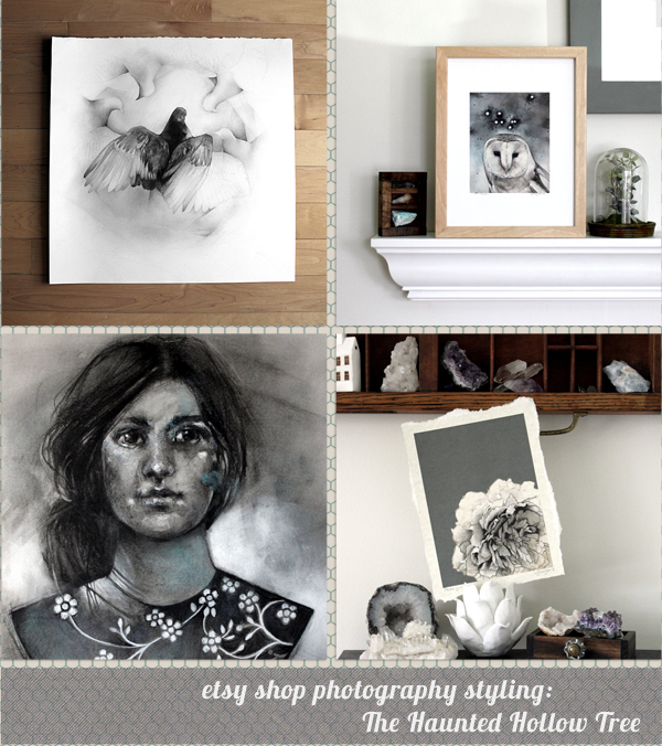
Each member had an opportunity to answer the question, “What photography advice would you give to a new shop owner?”. Lauren of The Haunted Hollow Tree also gives us some great insider tips, “Photograph each of your pieces in a variety of styles from the start. It’s a good time and a good opportunity to play around with various looks for your shots. While it’s important for there to be visual consistency through your listings, you don’t want your shop page to look stale, with each listing looking identical. Add in some flavor to your photo shoots and trial and error out your featured photo for each listing. A variety of styles and positioning could keep your listings looking fresh and make the pieces stand out from one another.” You can see 4 examples in the image above from Lauren’s shop to get a sense of how she approaches photographing her artwork in a variety of styles. I really love how Lauren shows her artwork in different settings as each one gives a different flavor and gives the customer a sense of what the work might look like in their home.
Caroline of Dark Ride brought up the Etsy forums, which is a great resource that can sometimes get overlooked. Her expert tip? Avoid the discussions and head straight to the search bar where you’ll uncover “old threads that are chock full of great advice written in user friendly, non photographer-speak language.” Nice! It can certainly be overwhelming when you first get started and you’re trying to photograph 40 items to post in your shop. What will be your photographic style and how will you convey your product effectively? Carolyn of Romy and Claire highlights the importance of consistency and don’t forget “continual improvement”! You don’t have to get an A+ right out of the gate – allow room for growth. Jenn of Palimpsestic pretty much nails it here with her advice, “Keep it simple, but find your own voice. Don’t be afraid of letting your style evolve over time and don’t feel like you have to rephotograph your whole shop to make it happen. Make changes slowly, find out what works for you, and don’t feel pressured by what everyone else is doing.” Yes, yes, and yes – been there! It’s so important to take it easy and be kind to yourself while remaining curious and flexible.
top left Studio By The Forest || top right Romy & Clare
bottom left Palimpsestic || bottom right Dark Ride
Jillian of Jillian Rene Decor teaches us to not be afraid to dive in and get your hands dirty! She says, “Take a TON of photos. No, seriously! When I first started out I thought that 20 was a lot. I was wrong. Take one of your items and take 100 shots. Use every setting on your camera, upload and see what worked. Then repeat the process! The more photographs you take the more you will learn about your camera, your product and what works best to represent your item to the viewer.” Cinne of by Cinne Worthington brings in her organizational skills, which is a huge gift to yourself so you can stay focused and approach things professionally. Cinne recommends, “Shoot with the majority of your light coming from a large window. Best light: bright shade – not direct glare. Do a few tests to find the best exposure/white balance/lens opening that works and write it down. Take notes for each shoot about what the weather was like, the time of day, the time of year ect. Write out these formulas so that you can spread out the shoot over a few days (save your back!). Make sure your product is perfectly presentable for the shoot. Clean of any dust or threads and nicely ironed (if it applies). Organize items in style and color groups – this makes photos easier to work on and organize in post-production. Play around with composition of item and shoot a few different ways.” I think I want to hire Cinne to take over the photography for my shop! I am by no means this organized, so I learned a lot from Cinne’s advice on how to make the process run a lot smoother.
And finally, Anna of Studio by the Forest offers advice that touches upon the technical side of things where she recommends that you “get the best camera that you can afford and learn how to use it properly.” Absolutely, Anna! Without a camera, we really have nothing to talk about here on this topic so getting a camera that will meet your needs is a crucial first step!
I hope you walk away from this post with lots of good advice to build upon. If you haven’t already, remember to check out my previous 2 posts as they’re value packed with insight as well. Thank you to each shop owner who participated in writing this blog post – your advice is truly a wonderful resource! As always, I’m here to help answer any of your questions and look forward to meeting up in the comments below!


[…] Etsy Shop Photography : Advice for New Shop Owners { Oh My Handmade} […]