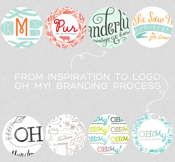
{top row inspiration: Moglea logo, Judy Kaufman, Wanderlust logo, She Saw Things logo}
Jessika has shared her new logo with you, and I thought it would be fun to peek into the process behind the work.
We are hard at work behind the scenes on the brand new and excitingly improved Oh My! at Aeolidia. Of course, Jessika has been the ideal client all along (Lauren told me she saves Jess’ messages as inbox “dessert!”).
She brought many ideas and inspiration to the table, which I’ll include below:
Describe your ideal logo:
Smart (think big glasses & pocket protectors, always has the answers) but a little silly & sweet (think country kitchens, crocheted granny squares & tea & yarnbombing) + a wee bit sexy (in a Brooklyn librarian gone blogger sort of way).Adjectives:
Community, warm, inviting/welcoming, handmade, eclectic, diverse, businessy, quirky/unique/off beat, inclusive, bright, uplifting, inspirational, like going over to your best friends house.Color preferences:
I am a colour floozy-I like them all except muddy/dull colours. I am most drawn to bright/vibrant/saturated colours like hot pinks, purples, turquoise, lime/chartreuse, sunny yellows, muted by white space or soft greys.Logo concept ideas:
I definitely want the business name to be hand lettered & then there to be some other illustrative/design element. I would like to be able to use the lettering & the illustration together or separately depending on the project/design.Otomi style:
I love indigenous art and the vibrant colours + whimsical patterns. One idea I had is to take the otomi idea of repetitive patterns but use houses, hands, teapots, rockets, pencils, laptops, scissors etc as the graphic elements…
I thought it would be fun to see the progression from first sketch to final identity! Here are the ideas Joel & Ashley of This Paper Ship worked on along the way to the final (last image).
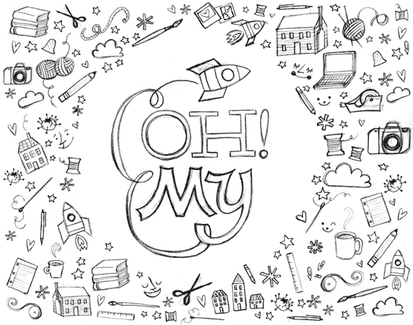
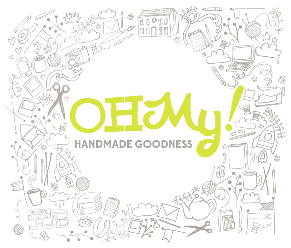
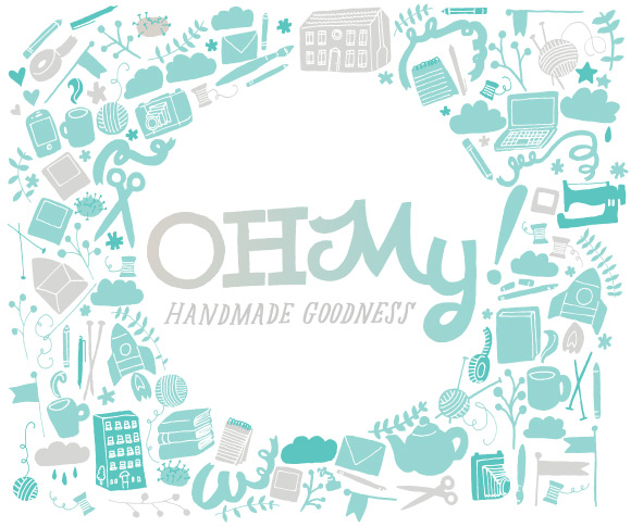
Jessika said, “I love this – it is the perfect balance of serious/silly, feminine/masculine & I can see it working with everything.” We are all in love with the new look (and having a grand time working out the site design details). Stay tuned!
*Editor’s PSST! Working with Team Aeolidia and Arianne has been a dream come true-they’ve gone above and beyond to make our new brand and site a reflection of not just my ideas but the needs of our community. Thank you to infinity and beyond for everything I can’t sing your praises loudly or far enough! Look at the amazingness that is on the way:

Help build the OMHG community and your business in 2013! We’ll be shifting our sponsorship packages when we move to the new site in February but are looking for a few sponsors to join us now. Shop our advertising page and join our community of goodness-lock in your ad rates, support our big redesign, and promote your business to our growing readership. What better way to start the new year then adopting a community of your very own? Happy biz building! xo, Jessika

