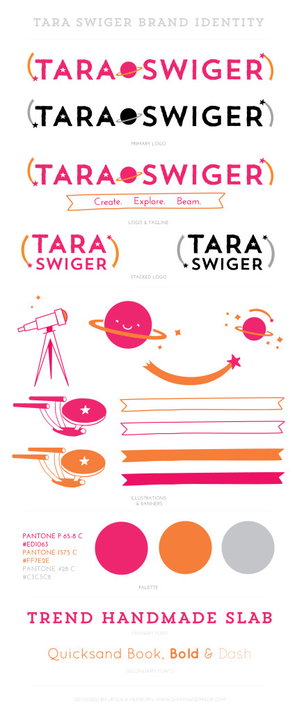
I recently had the experience every designer dreams of-an enthusiastic client who was able to clearly explain their brand story & customer + had a love for spaceships! From the second Tara Swiger emailed me about redesigning her branding and website I knew we were going to have a grand time working together, so even though I wasn’t even looking for new projects I said yes! Her work is all about exploration and enthusiasm, two things that couldn’t be closer to my heart. A new brand, like any good adventure, is exciting and also often a little scary. There is such a pressure to get it right since a brand is the public face of the business and it is a big investment, I’m so glad Tara agreed to visit us to show off her new brand and tell us a bit about lessons learned from our exploration in rebranding!
We’re talking all about adventure and exploration this month on OMHG & together we just went on a giant adventure together to rebranded your business and launch your new website! I’d love to start by asking when/how did you realize you had outgrown your old branding and website? What was no longer working for you?
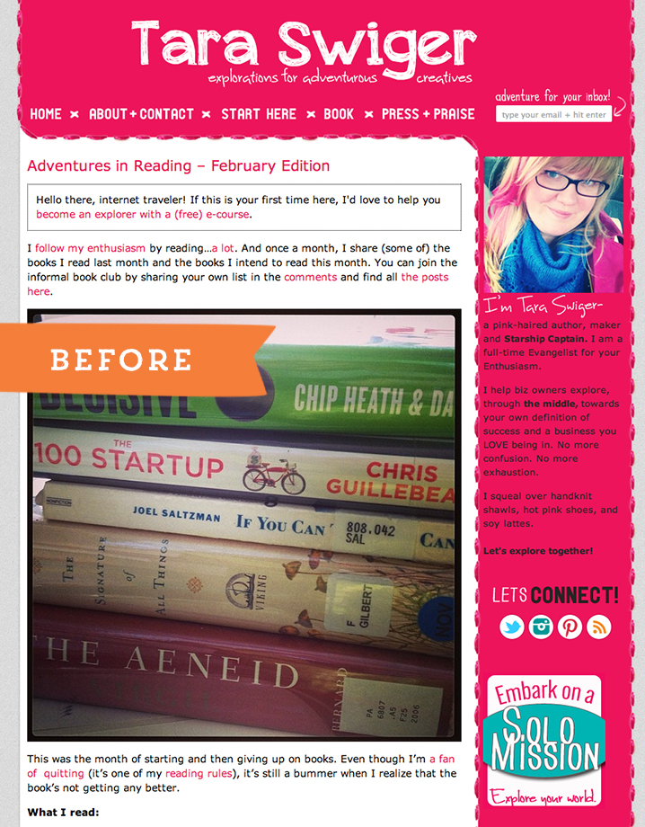
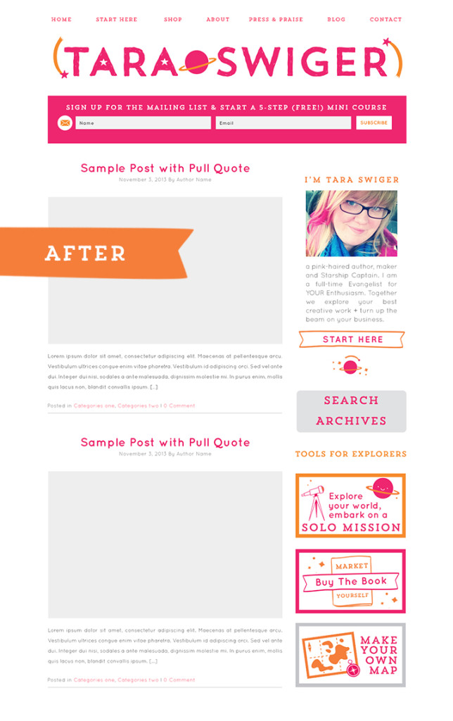
Before the first mock up is ever created there is a whole process of getting to know each other and exploring your business – did you find that process valuable for you?
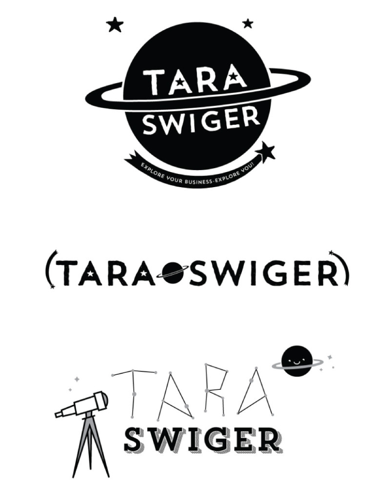
First round of concepts for Tara’s new logo
What was your favourite part of the design process? What part did you find most challenging?
I’ve noticed designers don’t usually talk about how branding can be an emotional experience for people. I often feel part of my job while designing is to help clients navigate those ups and downs! Did any big emotional shifts happen for you during your rebrand?
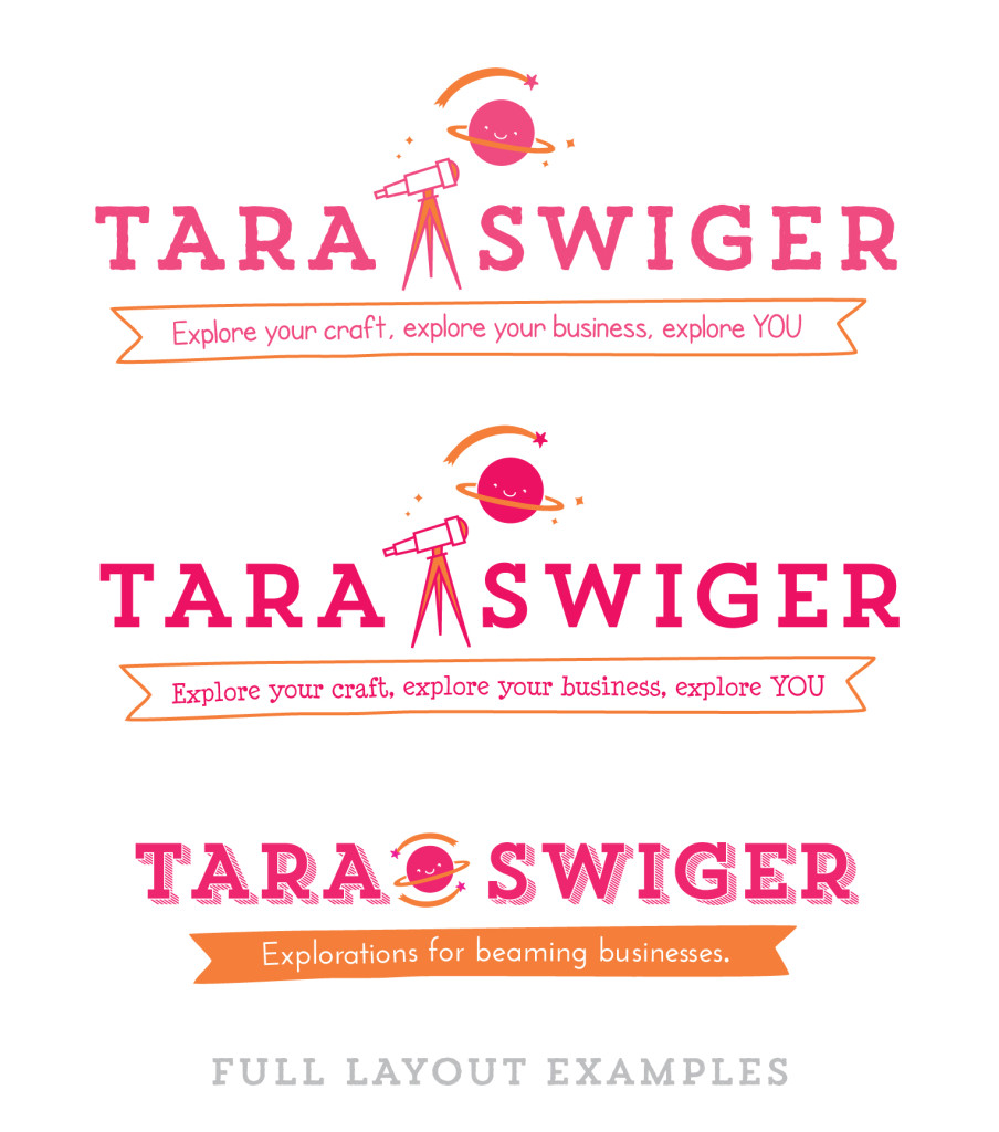
Exploring layouts in round two
We chatted a bit about how investing in a new, more functional website & beautiful brand is a lot like moving from a well loved but too small apartment into your first house. How are you settling in to your new digs?
Do you have any suggestions or advice for other makers or creative entrepreneurs who are wondering if they are ready to grow by investing in a designer?
1. Get clear on what you do and who you are.Spend time clarifying your own message. What does your business DO for your buyers? Who do you serve? What’s your overall mission? What’s your vision of where you’re going? (I help you define your mission in Chapter 2 of my book). This isn’t just about your visual brand, this will also inform the words you use, the photos you share, and how you show up on all social media..In other words, you’re not ready to invest in a designer until you’ve invested the time in becoming clear on your message.
.2. Do the math.Know your overhead, what you earn each month and what you can afford to pay a designer while still paying yourself. This may sound obvious, but I talk to a lot of makers who feel “ready” for a redesign but have no idea how much money their business has to invest. Dig in and be honest. (And if you need to, save up!).3. There’s nothing wrong with going slow.You do not need a gorgeous design right out of the gate; you need a clear message. Good design will make that message more clearly communicated…but if you don’t know your message, the best design won’t be able to deliver value. And it’s OK to not know your message in the beginning. Keep working, connecting with your people, and learn from them. Over time a bigger message will evolve and the right design will light it up..
 You’ve got a lovely new brand with spaceships & all kinds of goodness, what is next for you? How are you hoping that this new branding will help you grow your business?

[…] Adventures In Branding with Tara Swiger – Oh My Handmade […]