My friendly web design studio, Aeolidia, is well-known for creating custom Shopify websites for creative businesses – handmakers, designers, and crafters of all types. It is always thrilling when a client comes to us who really understands what her business is all about and what the personality of her business is, but she hasn’t been able to translate that to a logo and solid brand identity. Then we get to start from the start and make it all make sense – usually to the joy and amazement of our client. No better feeling than learning and understanding the point of view of a brand and making it come to life in just the right way.
What does “branding” mean, anyway?
You can think of your brand as the personality of your business. What does your business offer your customer that no other business can? Your brand should speak directly to your target customer, making you THE only choice for them. There are hundreds of options when someone decides to buy a cup of coffee – why are so many people at Starbucks? Branding.
To create a brand for your business, you don’t start with the logo. You start by brainstorming what’s unique about what you do, and putting together a description of your business’ personality which highlights why a customer will want to choose you over others. Once you know what your business is about, you’ll have an effective starting point for making sure your products, your logo, your marketing materials, and your advertising all make sense with your brand identity.
Excerpted from Branding Your Company on our blog
Brand identity examples
Jessika asked me to share some brand identity examples from our studio, and today I have Posie, a shop selling handmade stuffed animal kits, Little Hip Squeaks, makers of adorable graphic children’s wear, and Umba, who empower artist entrepreneurs.
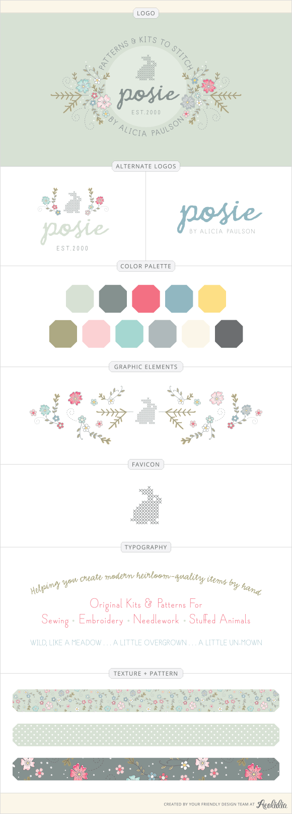
A delicate, cozy logo for Posie
Alicia writes the Posie Gets Cozy blog, and she designs original patterns for sewing, knitting, embroidery, crochet, and other craft projects, and also manufactures kits to accompany her designs. She also sells a small, curated collection of her favorite supplies that are handpicked specifically to help customers make her projects.
She has been in business since 2000, doing it all herself, and the time finally came this year to work with professionals on a cohesive brand identity.

Before we began, Alicia told us:
I want the logo to feel handmade. Since everything I do is handmade, I think it’s important that it feel sort of painterly and natural but still detailed — in an old-fashioned embroidery-pattern kind of way. I don’t want it to feel computerized. All of my embroidery patterns or sewing patterns, whether self-published or in my books, have been done by hand, by me, in black marker, and I will most likely always do them that way. So I want these drawings to have that simple, clean, black-outlined feel. But I also want the elements themselves to feel a little tangled, a little enchanted, and a bit wild. So I also envision having some elements that are not outlined but are more like circles of color that float a bit (I’m thinking about dandelion puffs and seed pods), and lead off.
It was such a delight to bring Alicia’s world perfectly to life! Mariah DeMarco on our team was her designer, and the brand identity includes some of Alicia’s own illustration work.
Learn more about how Alicia runs her business and how it’s grown on our blog.
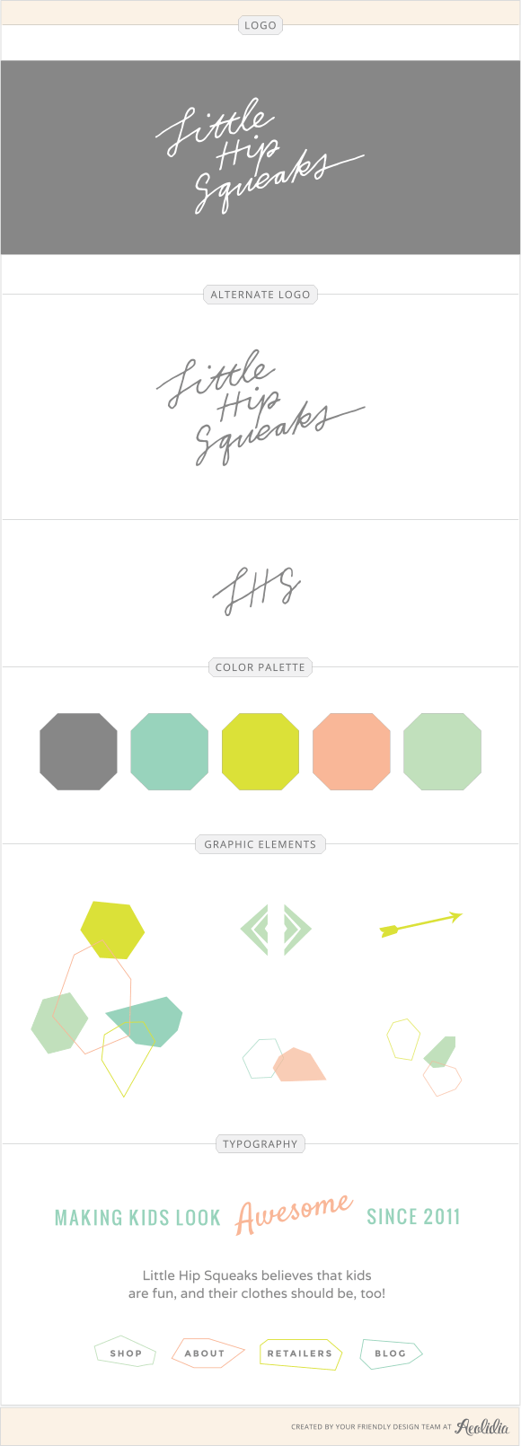
Little Hip Squeaks’ graphic & handmade brand
It hasn’t been that long, but Little Hip Squeaks’ identity feels like an Aeolidia “classic” to me already!
Little Hip Squeaks believes that kids are fun, and their clothes should be, too! Our aesthetic is for of bright colors and bold prints, with modern babies, tots and kiddos in mind.
In the winter of 2010, Little Hip Squeaks was started at a kitchen table, in a one bedroom apartment in Brooklyn. Originally a side project for founder Amy Richardson, to keep her hands busy during pregnancy — sewing newborn hats for her not-yet-born son, and the new babies of good friends from thrifted t-shirts.

Amy came to us with these problems to solve:
The growth of our brand has been pretty major over the last 6 months—although I am a designer myself, I never seem to find the “it” this brand needs to have. Too busy with growing the biz, I can’t focus, or even think of what direction I’d like to take the logo and identity. We are a children’s brand, playful but luxury and sophisticated, so I don’t want to look childish, but I also want to be obviously a brand for children.
We are about to embark on the world of manufacturing, and have a lot of major internal changes for our company—we are also working with several major retailers, and feel that before I invest in tagging/branding I want to REALLY love our logo and brand.
Amy’s designer was Christine Castro Hughes on our team, and she shared,
You gave me great, clear direction: strong typography, curvy, modern, sophisticated, and playful but not childish. Something that appeals to hip, young, modern women.
I created four hand-drawn concepts, each with an accompanying monogram. In order to avoid getting cutesy, I kept the type clean with simple illustrative elements (including one sketch with olive branches, like you requested). I also tried to avoid anything too trendy, like the arrows that I agree are now seen everywhere. I think a logo that “holds back” a little will have a longer life span for you and continue to fit your brand as the seasons change and your business grows.
Learn more about Little Hip Squeaks and see more about this project on our blog.
Umba’s whimsical modern-vintage brand
Founder Lauren Thorp told us:
We started Umba (from a Swahili word meaning “to create”), as a way to better connect makers + consumers in a more dynamic way. As Umbassadors (our team of social-savvy sales reps) gather their network of friends & family in homes across the country at fun and social Trunk Shows, they’re able to effectively share the positive impact that buying handmade has on the makers’ lives.

Lauren wanted something clean, but with character and unique elements. She was looking for something somewhat vintage, but modern, with a bit of whimsy. She told us that she was a fan of hand-lettering, and her designer, Christine, created this logo with a brush on paper, bringing it into Illustrator to create a vector logo that can be scaled to any size without losing quality.
How do you describe your brand?
If your brand was a person, could you describe her? Can you easily look at a product or design and know if it fits with your brand or does not? Is it time to get clear on what your brand stands for?
We have quite a handful of branding articles on our blog that will be helpful (with more info about the projects above), and I often send people to Why You Need to Start With the Logo when they’re not convinced that their brand identity is worth spending some time on.
I’d love to hear more about the words and images and principles that fit with your own brand in the comments.

