This September, I quietly opened doors to a new coworking space and clubhouse for creatives, Makeshift Society, in San Francisco. It’s gorgeous but I can’t take the credit for that. My role is like a producer in the movies, relying on a fantastic team and delegating tasks to others. One of the tasks was coming up with our branding (deftly handled by our creative director Suzanne Shade, and discussed in further detail here on my blog) and another was creating a fun member kit to hand out to our new members. I wanted it to be whimsical but also informative, and include items that someone might use when they came to work. Finally, we had a fairly tight budget to create the kits, so the kits being makeshift/DIY themselves would definitely come into play.
Suzanne worked with Makeshift member Julia Kostreva to create member kits that riffed on our established brand guidelines and the results are below. I asked Julia to talk about the process of creating the kits. Read on!
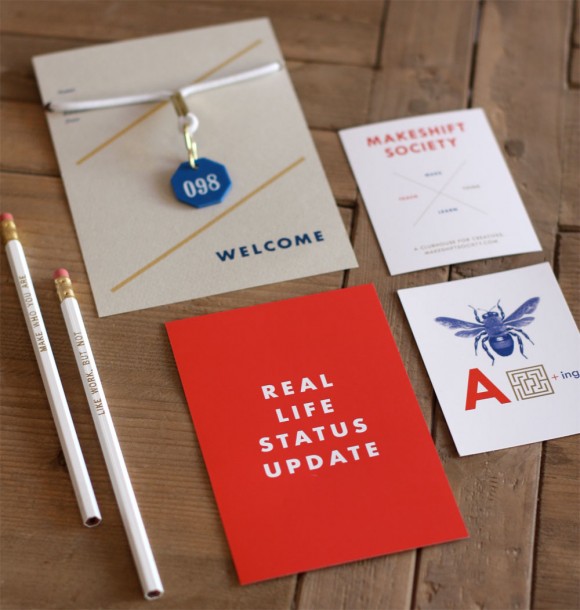
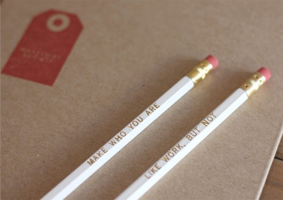
Working with a budget can be good because you can get pretty clever with the materials and printing methods to keep it exciting. Rena found these great pool tag bracelets for the member tags, which were available in the same blue color as our branding. We screenprinted the info cards in our brand’s blue and gold colors, and made notches for bracelets to wrap onto the cards using a hole punch. We ordered custom gold foil pencils with encouraging work/life messages that match our brand.
For a little fun we wanted to do an extra card that could be a “real life status update,” which is kind of a play on the old “do not disturb” sign. There are a lot of affordable printers online like gotprint or Vistaprint, which have fast turnarounds and pretty nice printing quality for basic things like postcards.
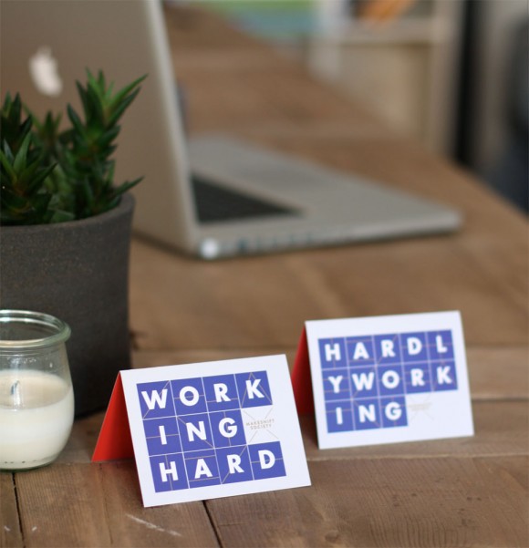
The member kit packages are kraft envelopes from ULINE, and we ordered a rubber stamp of a graphic tag of our logo. Even though we had a few different pieces in our kit, we were able to tie the branding together with our colors and clever copy. It wasn’t too expensive either!
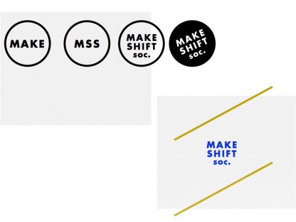
During my sketch phase, I did a little re-mix to the logo and branding by playing with the words “makeshift society” and geometric shapes to evoke a fresh Bauhaus feeling. The branding sketches ended up inspiring the different items in the kit. Check out the sketches below.
Editor’s note: Thank you Julie & Rena for visiting us to show off the amazing DIY Makeshift branding! Share your thoughts on their look and innovative co-working space with us in the comments and be sure to hop on over to Rena’s blog to catch part 2 of this post since there was too much branding goodness to fit here!

