Facebook has a some not-so-obvious sizes and settings for cropping and shrinking images, and I’m here today to demystify what they have going on and keep them from throwing a wrench into your graphic work.
So you have yourself a business of some type and you’re working on building your online community. Surely you have a Facebook business page, right? If so, let’s work on making it look as nice as we can. If not, you can start by setting one up, then get to work improving its looks.
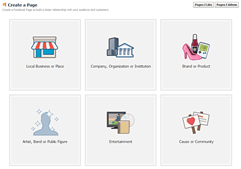
Create a page
To create a new page on Facebook, head to the Create a Page area, choose your page type, and follow instructions. Be sure to get your page “username” right, because Facebook is very strict about changes to it, and you can only change it one time ever.
Brand your page with a cover photo
All business pages use the Facebook timeline at the moment, which has two main places to add your own branding. You have the large Cover Photo, which shows at the top of your page, and the small Profile Picture which sits toward the bottom of the cover photo.
Below is my Aeolidia cover photo, which I recently updated to include information about the services we offer:
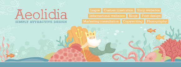
Go to your Facebook page and hover over the cover photo area to get the clickable “change cover” icon and click that to get a new image. The cover photo should be 851 pixels wide by 315 pixels high. Facebook will adjust it for you if your sizing isn’t exact, but I prefer to get it just perfect before uploading. The quality degrades extremely once it’s uploaded to Facebook, so you’re likely to not be thrilled with the final outcome – best to start with the right size rather than leave it in the hands of the Facebook Cover Photo Ruiner (at least that’s what I call it)! Photos are going to look better than illustrations here. Do as I say, not as I do.
Cover photos can’t be advertisements, and the rules for cover photos can be found here: How Should I Choose a Cover Photo For My Page?
Be recognized with a profile picture
 Your profile picture shows up overlapping your cover photo a bit. It will also show at a small size on the News Feed page by each post you make and super teeny on your own page when you post to your timeline.
It’s best to upload a larger photo here, because it’s clickable and people can see it big if they’d like. Go ahead and make it square and a decent size. Maybe 350-400 pixels square.
You can use your logo for this, or your lovely face, or anything someone could use to recognize your business at a glance.
Making your timeline posts look nice
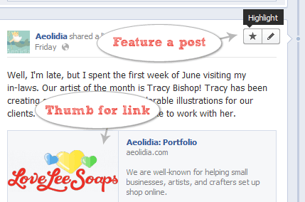
When you add a post to your Facebook page’s timeline, it will take up half the width of the page and be a single column. If you want to highlight a post and make it take up the full width (two columns), hover over it after posting and click the star icon to highlight it.
I have conducted some (frustrating) experiments with posting links and images, and these are the rules I’m sticking by.
Posting simple links: If you post a URL in the text box, but don’t upload a photo, it will let you show a small thumbnail image pulled from the page you’re trying to link to. You can choose among the photos on the page using the “choose a thumbnail” arrows, but you can’t control the size or how it’s cropped. Links usually look silly full-width, so if I want to highlight a link, I upload a photo instead (and add the link to my accompanying text).
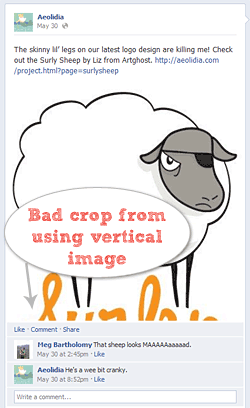
Posting small photos: If you want to announce something and also show a photo with it, switch the posting box from “status” to “photo /video” and upload your photo. You’ll be able to include text as well as a link with your photo. A single column photo should be 403 pixels square, to avoid any unexpected cropping by Facebook.
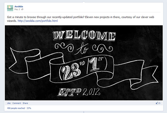
Posting large photos: If you plan to highlight a photo post, do the same as above, but make your photo 843 pixels wide by 403 pixels high. At this size, the photo won’t be cropped, stretched, or shrunken. After posting, “star” the post to highlight it and have it expand to fit the width of your page.
More resources
There is a lot more info and details available on Facebook for getting things all set up and optimized. If you’d like to dig into this further, here are some good starting places:
How about you? Do you have some clever tips we could use? Or perhaps some additional questions that the Oh My! community or I could answer? Let’s chat about Facebook pages a bit in the comments! We’ll also be chatting Facebook from design to engagement with Arianne at our weekly #OMHG chat tomorrow from 1-2pm EST. Come join us to share ideas for building your community on FB!