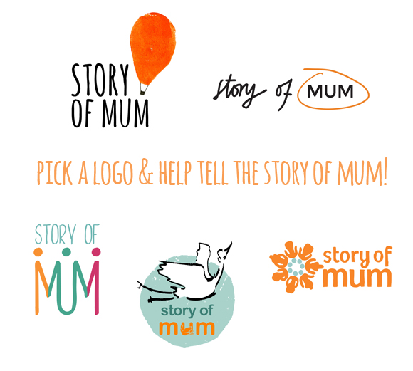
Story of Mum has never had a logo. Just words blandly spelling out our name. But as we’ve grown to understand what we are, and what we could be, (with the help of the Oh My! Handmade community) we’ve realised that we need to step into a clearer identity. To help us take that step, five Graphic Design students at Falmouth University have bravely developed ideas for a new logo and brand identity for story of mum, allowing us to share their process here. We would love your thoughts to help us choose.
The process
Mentored by dear Ellen Elwell and supported by Arts Council England, I developed a 2 page brief. This identified our primary audience (short version: mothers of under 10s) and message (short version: Join us!).
Our key visual/style notes were that we’re broadly happy with our current colour palette (you can see this on our website), influenced by contemporary creativity and the DIY/handmade art movement, and need a logo that can sit alongside diverse content and colours in a simple gallery space. Our key descriptors were:
- Community/Connection/Collaboration
- Bravery/Strength
- Joy/Happiness/Presence
- Fulfilment/Self/Growth
- Openness/Expression/Communication
We also found a new way to express our evolving mission:
To harness the power of creative activity and storytelling (written, visual, craft, arts) to help mums of all ages and backgrounds explore and express their evolving identities: fostering greater confidence, self-awareness and appreciation of both the negative and positive aspects of motherhood, while having fun.
I presented the brief in person last week and the students had just four days until I returned to hear their pitches and give feedback, selecting five to explore further. They had another week to make revisions, with regular email contact if they wanted it. We’re very grateful for their hard work and vision.
Each designer gave us a wide range of material (we asked for a logo alone, on the website, and featured as an exhibition flyer), some of which we’ve shared below, along with a short paragraph to explain their intentions.
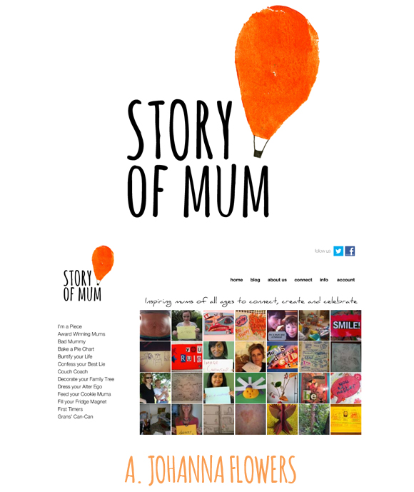
A. JOHANNA FLOWERS
“Story of Mum provides the strength of community, freedom to be creative and a sense of adventure. The balloon is an uplifting metaphor for the bravery and growth experienced by mums. The process of the balloon filling and creating the firm roundness that lifts it also correlates with pregnancy. I created a handmade logo with a potato print to reflect the creative aspect of Story of Mum. The effect is welcoming and contemporary and far from corporate. Overall the image reflects the journey that mums make and the courage and fun that goes with it.”
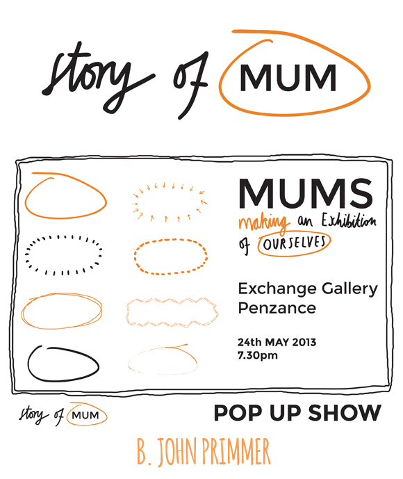
B. JOHN PRIMMER
“Story of Mum focuses on the importance of ‘me time’ for mothers. Circling the word ‘Mum’ reflects the emphasis on prioritizing this time, much as you would circle a date in the diary. Using the printed word ‘MUM’ helps anchor the logo, making this very much the ‘story of’ mum, written by mums and shared with other mums creatively online. The ‘circling’ brand mark can also be applied as encouragement to ‘exhibit’ your thoughts and feelings on the website or in a physical space. Mums could be encouraged to print out their own ‘MUM” to doodle on, adding ‘story of’ and the circle to brand their individual profile.”
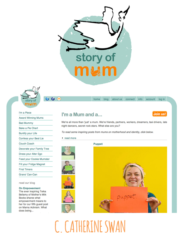
C. CATHERINE SWAN
“Reassurance was Story of Mum’s strongest message, signified here by the circle. Birds have a feminine shape that also signifies freedom. I chose the stork without the traditional baby in beak to imply a woman on her way to motherhood or blossoming as a mother. Storks have other nurturing attributes, squeezing water from moss to feed their young, grouping together in large numbers to protect one another at night. The Marabou stork also has an enormous wingspan measuring 10.5ft, which made me think of a comforting hug, the best hug of all, our mothers’!”
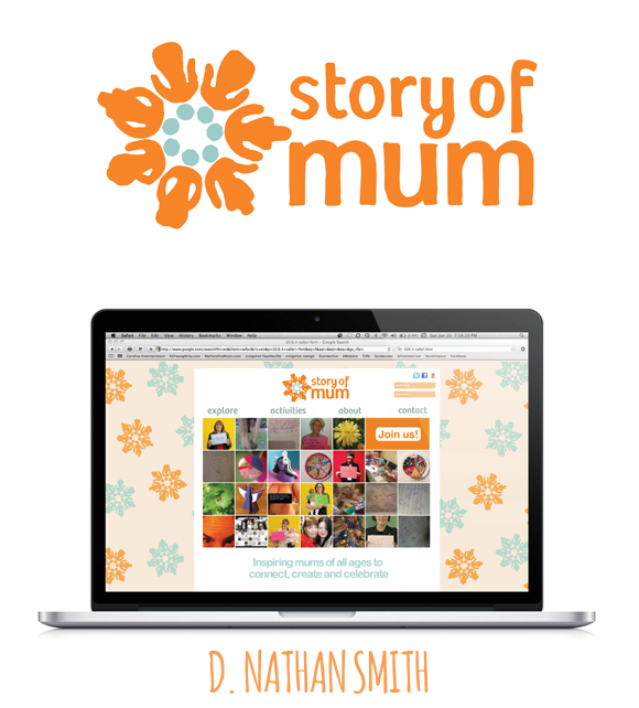
D. NATHAN SMITH
“Overall, the identity resembles a flower. Within this, the numerous ‘petals’ or ‘people’ are connected by a central bond. This represents a social hub, all mothers and all connected. However, each person has their own identity. They aren’t just a ‘mother’, they are themself. This is represented by each ‘petal’ or ‘female figure’. The idea is that this captures a sense of connection, joy, growth and fulfilment. The rough and uneven edges give a sense of handmade creativity and the use of pattern has also been inspired by patterning styles echoed throughout the handmade community.”
E. LAUREN WAKEFIELD
“Story of Mum has a strong sense of community, allowing mothers to come together to share experiences and to have fun. My logo design represents this, as well as the idea that each mother is a unique individual brought together by Story of Mum. I focused on the word ‘Mum’ as they are after all what makes the brand, with each letter as an individual person connected by their roles as mothers. Joining the letters shows them holding hands – a strong sense of support and comfort within the mothering community.”
WE NEED YOUR HELP!
We would love to know your thoughts! Which do you think best capture the spirit of Story of Mum and the ideas within the brief? What might we think about next as we take one of these designs further?
About the Author Pippa Best
I live in Cornwall, UK with my salty-skinned surfing film-making husband, boisterous 4 year old boy who thinks he’s an Octonaut, and nearly 2 year old daughter who inspires me by saying YES as if it’s the easiest thing in the world. Life is a constant plate-spin of intuitive mothering and my work as a feature film script editor and project manager. My passion is www.storyofmum.com, an online community of supportive brave mamas doing uplifting, thought-provoking, downright silly stuff together to celebrate the ups & downs of motherhood. Come join our #somum Mums’ Make Dates (2nd Wed. of every month from 8.30 – 10pm GMT on Twitter).
Join us online, like us on Facebook, and Pinterest, and follow us on Twitter @storyofmum.
Just taking a quick look at the stand-alone versions, I like A the best, followed by E. On the website, I like A and C. I’m not feeling the other two at all, and the usage of D actually really puts me off.
i like C.
Well done to the students! These are all creative and well thought out solutions. Though I love the idea of E, personally I think A the balloon looks great! Plus the balloon icon can be used in all different places, with or without the text, which often comes in handy more than people would imagine.
I like A
The students did a fabulous job! I was instantly most drawn to A. I like the look of C, but the stork makes me think of babies, and you said your blog is geared to moms with children up to 10.
Thanks so much for all the feedback so far, this is SO useful to us going forward. It’s really interesting to see which identities grab people straight away, and which capture the spirit of story of mum – it’s also a fascinating process to discover how other people define the spirit of story of mum. Thank you x
Hi Pippa , I like A and D. I like A as it seems to say anything is possible . I like the connectedness of D. Sorry to give you 2 likes . As I’m typing I think on balance A is the more eye catching. so A. For me. Anne ( baby wisdom uk) xx
I really like A and E. E seems a little more relevant but A is more beautiful.
First of all I think they all did a great job! I love it when students have the chance to tackle a real world design “problem” and not an abstract theme. I am totally undecided between A and E. E has the family and the community in the same symbol. But I can’t resist a red balloon, it is so uplifting! So A it is. Again kudos to all the students!
I think A is it! Love the creativity of the others though. Love to see this type of creative group think.
I must be the odd one out! I prefer B – because I think it’s all about mums and I think it’ll make the site more interesting and less ‘samey’. I also quite like D but only if you really want to push the ‘crafty’ element. E reminds me of Mumsnet!
For me, the ‘A’ logo, hands down, because: It is highly simple graphic and would look great as a stamp, put over an image, or as a solid color. It feels creative, a little improvised/handmade, and down to earth. The balloon as a symbol says much: onwards and upwards, adventure and journey together, and cheerfully optimistic.
Yay for a new logo!! It feels good when things fit together.Good luck picking. They are all lovely!!
A is great, although maybe work on the lettering a wee bit, but C also looks great visualised on the website. From the comments it looks as though A is winning it! The others don’t do it for me. Don’t like the stork at all! Although sometimes I wish Nelly had been gently delivered neat and perfect by a bit white bird, I really think mums need more credit for doing the hard work … it might be going a bit over the top on these thoughts, but I think Story of Mum has such a great, friendly and strong identity (and background), you can do great things with a stronger visual, go for A or C! xx
I like Smith’s logo best but Wakefield’s overall page design.
I really like B – the concept behind circling the word MUM for me highlights the balancing of a busy life and ring-fencing ‘me-time’.
D. My reasoning might be a bit strange. They are all good. But D is in a good shape that will fit anywhere on any advertising space, on any guest blog, on any marketing material.
B and E… At first I liked A but then realized that I don’t really “get” the balloon. B and E are super clean and eye-catching.
I like B and D – B because i love the idea of the different message spaces, sharing stories etc and D because i love the way the people are the petals, a flower makes me think of mothers blooming as we grow into our parenting journey etc
These are all amazing! What a group of talented artists from Falmouth University! I really like E, it’s clean and really drives home the connected community aspect. However I am smitten with A- and truly appreciate the fact that this designer thought outside the box… using a potato stamp! Love it.
B for me – simple but highlights ‘Mum’ perfectly
Thanks so much everyone for all these thoughts – I’m so pleased that the student designers’ work is being so (well-deservedly) well received. Really interesting! At the moment, there seems to be a slight majority here and on http://www.storyofmum.com in favour of A (although on our blog, a few people have said that balloons have sad associations for them, linked with hospices and funerals? Anyone else have this?) with many describing their choice as more of a ‘gut’ response to the image.
Yet the ‘story’ of story of mum seems to be more easily seen in E (which seems to prompt a slightly more intellectual response) or B (many see this as a great simple concept, others don’t feel it stands out). C and D have their fans, but seem to divide us more. With some loving all the ideas contained in the flower and others being put off by the wallpaper. It’s also really interesting to hear the feedback about the stork, as Catherine did a great job of exploring that idea – but does it resonate too much with the idea of birth/early stages of mothering, even without the baby…and our reach is broader?
Looking forward to many more opinions in the next couple of days, thank you so much for your time and insight.
I love all of these! My eye was first drawn to D, the one with the letters holding hands. That just seems truly special and represents what you are all about. I do like A also because that balloon is just so darn cute 🙂 Good luck choosing!
I really loved J.Primmers logo.
The hand drawn circle around the word mum is an excellent idea! It demonstrates ME TIME. Mums are usually selfless and tend to forget that they are people and need to look after themselves as much as anyone else. Simple & very effective.
I really like A aswel, but think that it will be harder to fit in with everything else, as the shape & weight of it kind of throws it out.
E works for me. It shows women as strong individuals who support each other.
A jumped out at me the most. Balloons say happiness and freedom to me, not sadness as you said some have mentioned.
They are all beautiful, but E gets my vote. I love how they made the letters become people holding hands, further adding a sense of support/community.
I love E!
I like d but I think its too subtle that the petals are people. I dont think anyone would notice. It took me a while to figure out that A was actually a balloon, so for that reason i dont like a.
I love C. I think its beautiful and it shows love, nurture, strength and femininity. The others dont really conjure anything other than “it’s a logo” in my mind.
Good luck with your decision xx
I really hope you choose E because it’s a stellar concept, complex in its simplicity. You may want to change the font of “story of” though; not sure.
Great work here by all. I pick A. I love the simplicity and childlike quality to it. The potato print was a great idea. I would love to see a bit more with the air balloon. A woven basket maybe? or two simple figures in it…a mom and baby?
What a good idea, Pippa! First off, I love that you are supporting up and coming designers. Now, to comments. I found A most striking, with the bright balloon and use of white space. I love the fonts, both in the logo and in the tag line. And, I like C & E for their layout and use of the rounded “band” hugging everything in. I like the integration of human figures in D to create a flower, but don’t care as much for using the flower-snowflake as background. And, of course, these are just the highlights. To the artists–way to go on putting your work out here! Really, they are all very professional.
Oh this was sooooo fun! I loved getting a chance to see all the designs and be a part of the evolving story of Story of Mum. A community designed logo, YAY! I was interested to see how here the votes were in favour of A but on our FB page D got the most response! While I love the creativity and the reasoning behind each of the logos (so well considered students! You have grand careers ahead!) I was most drawn to A over and over again. I love the lettering of B’s “Story of” and the hasty mum scrawl of it-I also love how E captures the spirit of community, and the mother focus of D & C . But A has the strongest design on a purely aesthetic and emotional level for me-it is so sweet and uplifting! The handmade element (a potato print logo is supremely awesome) also references making with little ones without being obvious about it. The only thing I feel it lacks is some context for your community like @colleenattara:disqus suggests in her comment. One thought I had while looking at the design is that the balloon could be a fingerprint-image of Ed Emberly fingerprint art for example. This idea plays into the idea of individual stories & could be a fun way to get your community to participate-they could scan a fingerprint & add it to a balloon brigade! Who doesn’t want to lift off from parenting with friends every once in awhile:)
Good luck choosing a new logo from these final designs-I can’t wait to see SOM all dressed up & ready for this new phase!
Thank you so much everyone! Thanks to all your fabulous input, and more feedback from our community at http://www.storyofmum.com and on twitter and facebook (we had over 100 responses, which is just fantastic – the most amazing market research experience too…), we are now down to two. All of the designs had keen fans, but these two came out on top in the sheer number and enthusiasm. Drumroll…
A (the balloon) and E (the hand holding MUM) – so we’re making progress! These two talented designers are now making some final revisions based on the feedback we’ve had – broadly speaking, exploring ways to find more community in the balloon, and more handmade/independent spirit in the hand-holding… Fingerprinting will definitely be explored, possibly in both of them! And we’re very much hoping to choose our final version next week to share with you all.
It’s been a fantastically useful experience for the students as well as us, thank you all for sharing your instincts and expertise so freely. Hooray for Oh My! Handmade